Thallo Building
Case Study
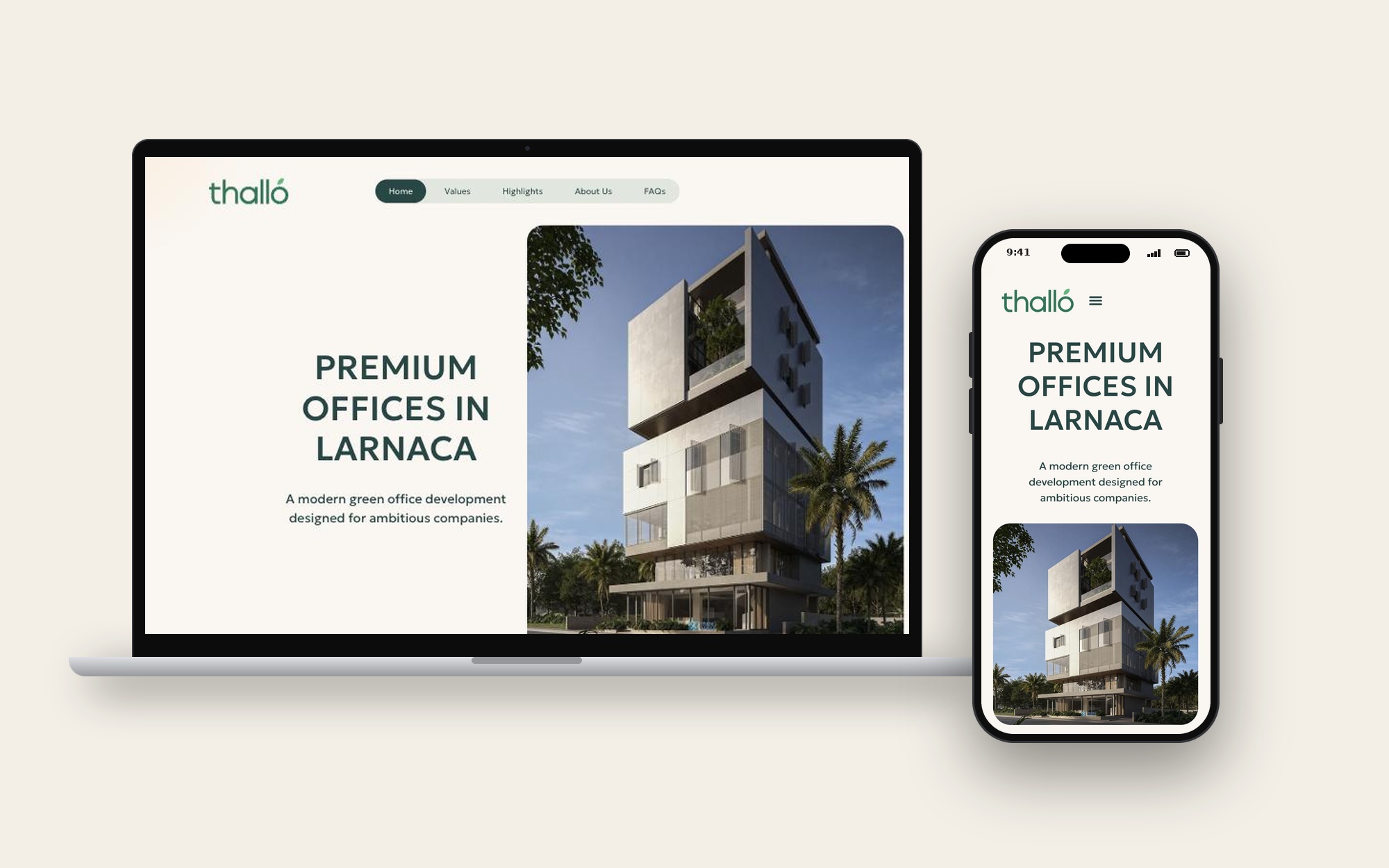
Thallo is a new green office building in Larnaca, Cyprus, developed by Studio Office. It offers 2,068 m² of flexible office space for growing companies and regional headquarters, with completion planned for 2027–2028. I designed the one-page website as a UI/UX designer with Absolute Websites.
Role: UI/UX Designer (freelance, with Absolute Websites)
Client: Thallo / Studio Office
Team: Absolute Websites
Timeline: 3 weeks of design, 2026
Scope: UX, information architecture, UI design, responsive design
Tools: Figma, FigJam
Website: thallobuilding.com
Problem
Thallo is still under construction, so there is no finished building to show. Companies looking for an office need to picture the space, understand what they can rent and decide if it is worth a viewing — all from renders and plans.
The audience is business owners and office managers from tech, finance, shipping and professional services. They compare several buildings and want facts quickly: location, size, features, timing.
How might we help a company understand the building and the available space in one visit, and make booking a viewing the natural next step?
Goals
- Explain what Thallo is in the first screen
- Show the building's features and sustainability clearly
- Make floor sizes easy to compare
- Answer common questions before visitors need to ask
- Turn interest into viewing requests
- Keep everything on one page that works well on mobile
Research
- Brief with the client and the Absolute Websites team: audience, key selling points, timeline
- Review of four office developments and business centres in Cyprus
- Content audit: renders, floor areas, building features, FAQs
- Page structure agreed with the client before wireframes
Main finding: companies choosing an office look for hard facts first — size, location, features, completion date. Lifestyle text matters less than clear numbers.
Audience: growing companies need flexible floors, regional headquarters want the whole building, and office managers care about practical features like parking, EV charging and climate control.
Hypotheses
H1. A short headline "Premium Offices in Larnaca" with a "Book a Meeting" button will explain the offer in the first screen. Measured by scroll depth and hero button clicks.
H2. Six building features shown as short cards will be easier to scan than long text. Measured by time spent on the features section.
H3. A floor-by-floor list with indoor, outdoor and total area will help companies find the right space. Measured by "Book a Viewing" clicks per floor.
H4. An FAQ section will answer common questions and reduce simple enquiries. Measured by FAQ opens and the share of enquiries asking the same questions.
H5. A short form with four fields will increase viewing requests. Measured by form submissions per 100 visits.
User flow
Main path: hero → project value → building features → floor specs → book a viewing.
Quick path: hero → "Book a Meeting" → contact form.
Sitemap: one page with anchor sections — Home, Values, Highlights, About Us, Specs, FAQs, Contact.
Solution
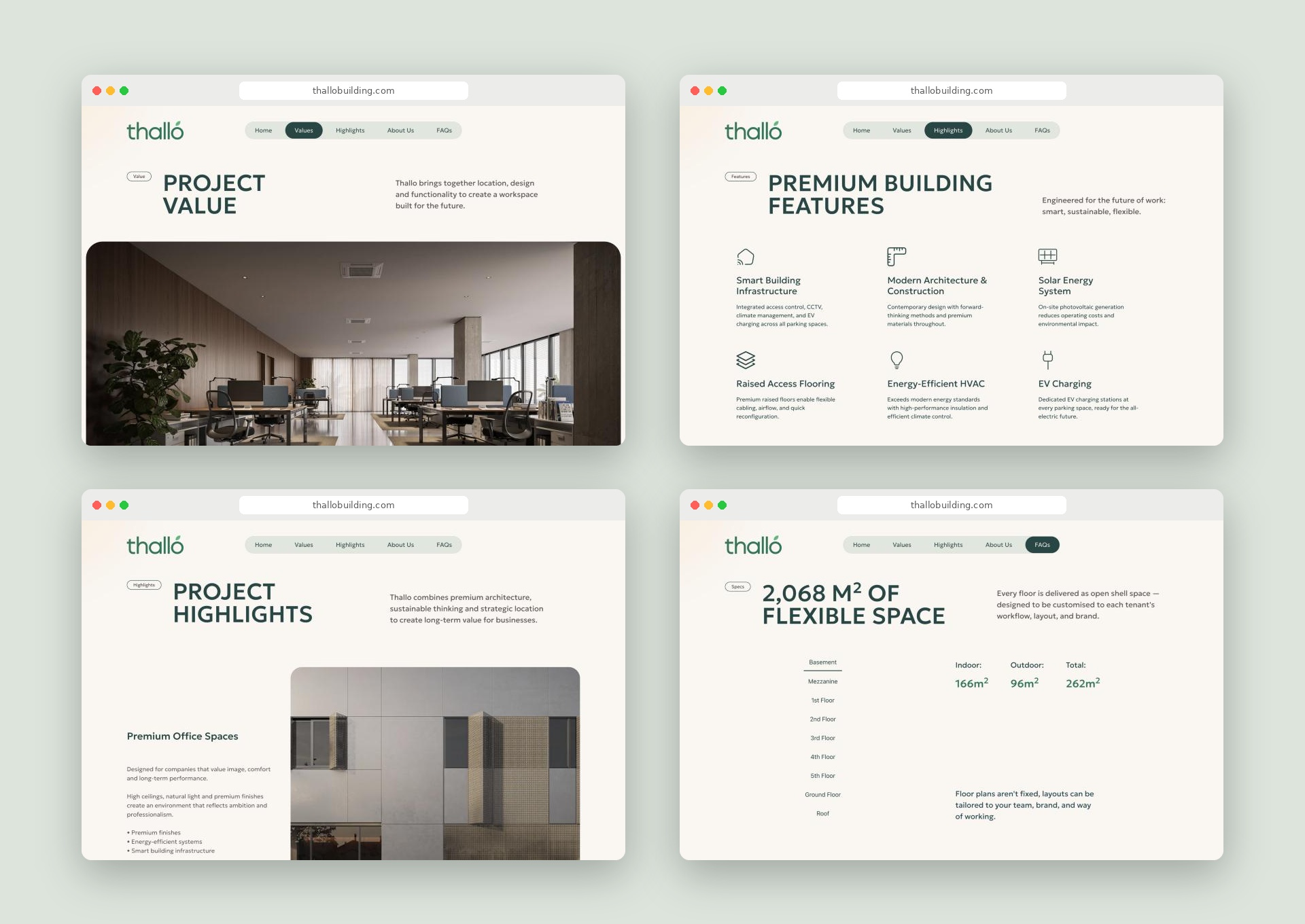
One-page structure: the site has a single job — get viewing requests — so all content sits on one page with anchor navigation.
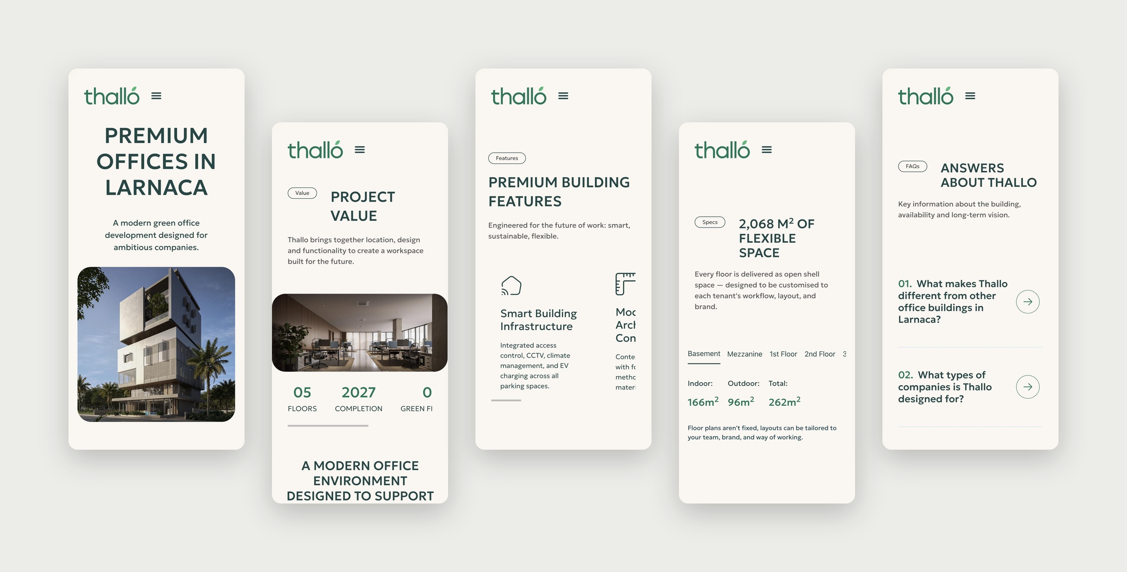
Hero: "Premium Offices in Larnaca", a short tagline, a concept render and a "Book a Meeting" button.
Key facts row: floors, completion, green features and business access as short numbers under the intro.
Image gallery: interior renders help visitors picture the space before it is built.
Building features: six cards — smart building, modern architecture, solar energy, raised floors, energy-efficient HVAC, EV charging.
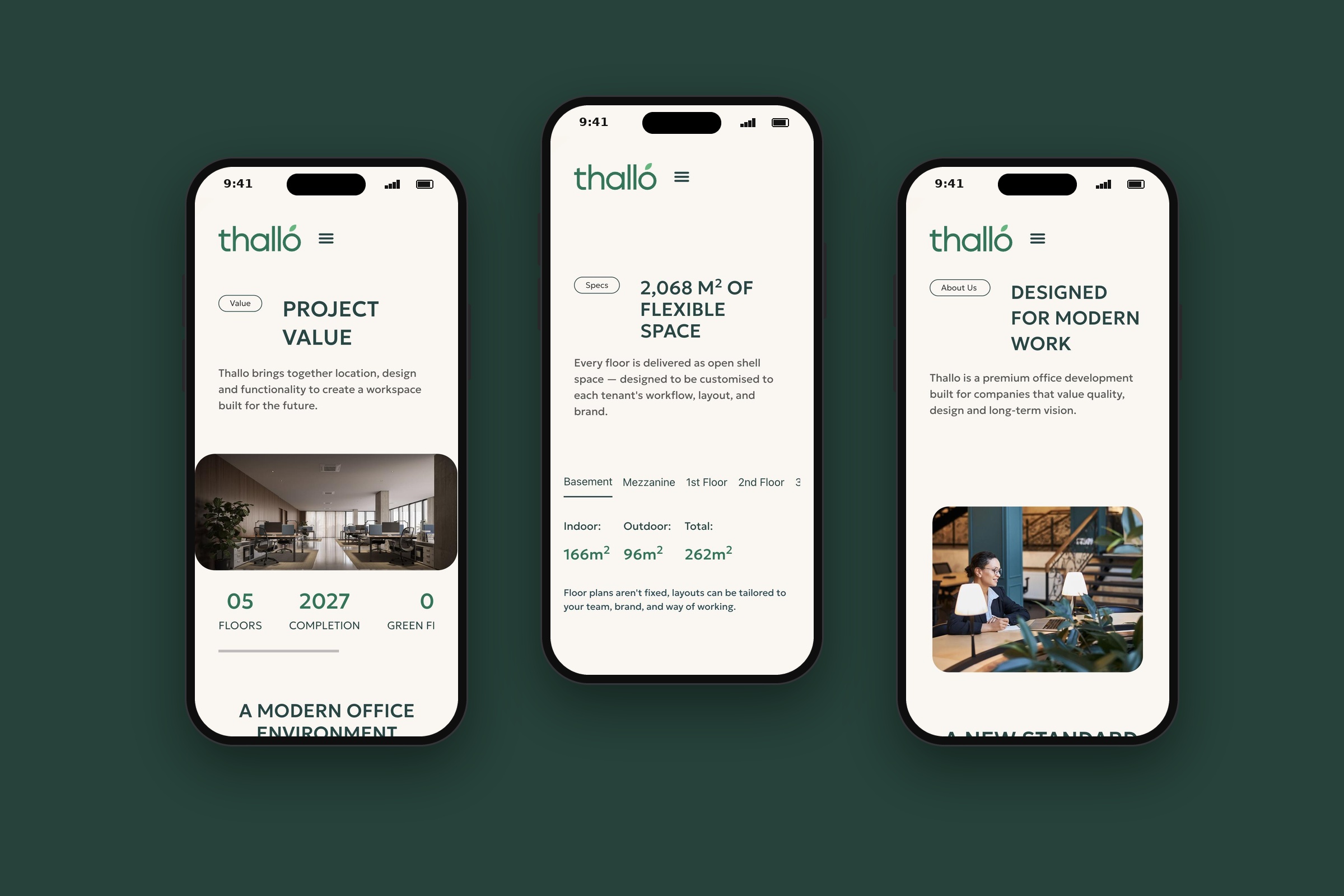
Specs: each floor listed with indoor, outdoor and total area, and a "Book a Viewing" button next to it.
FAQs: six short answers about timing, single-tenant leasing, the developer and the name.
Contact form: name, email, phone and message, with a "Book a Meeting" button.
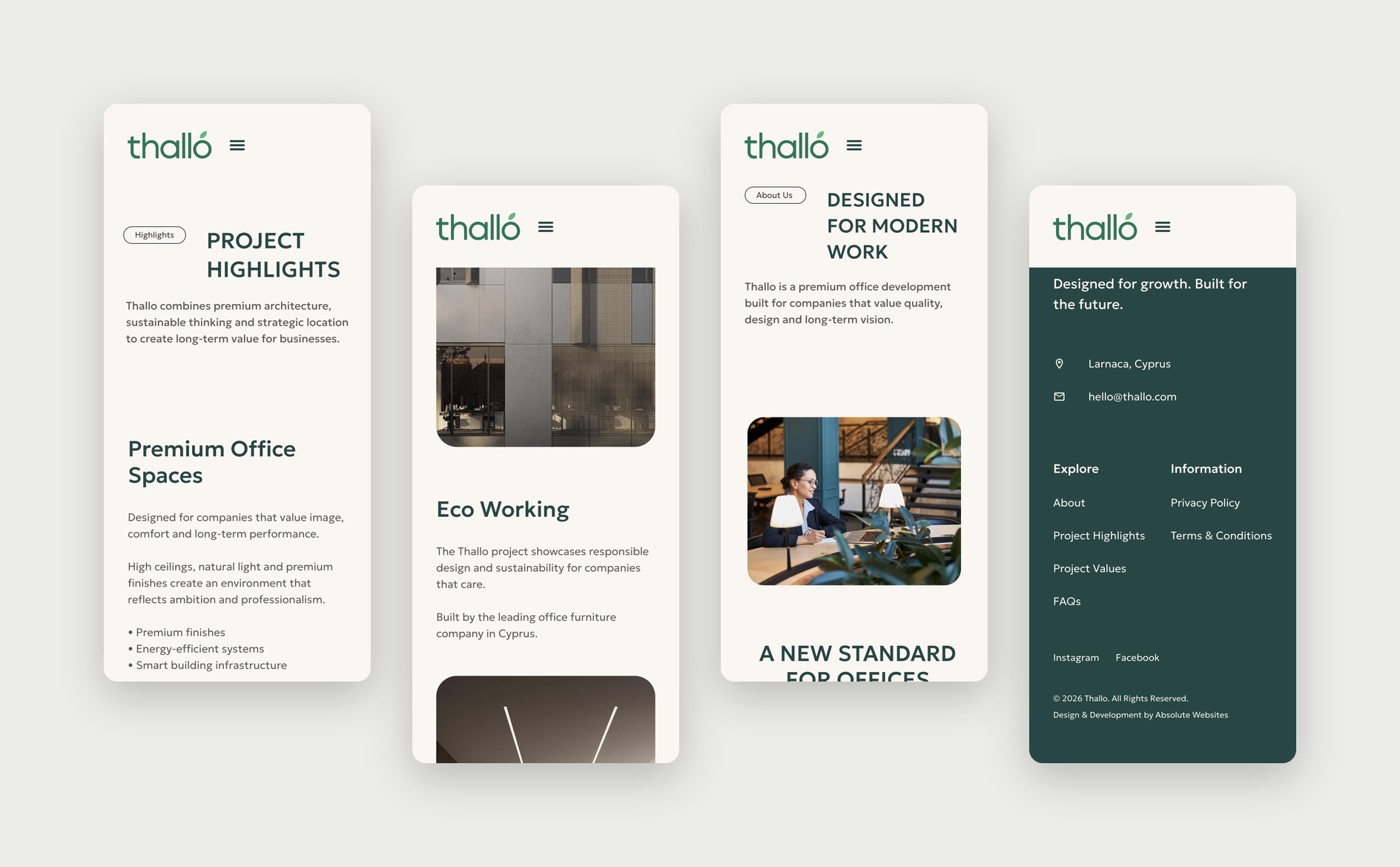
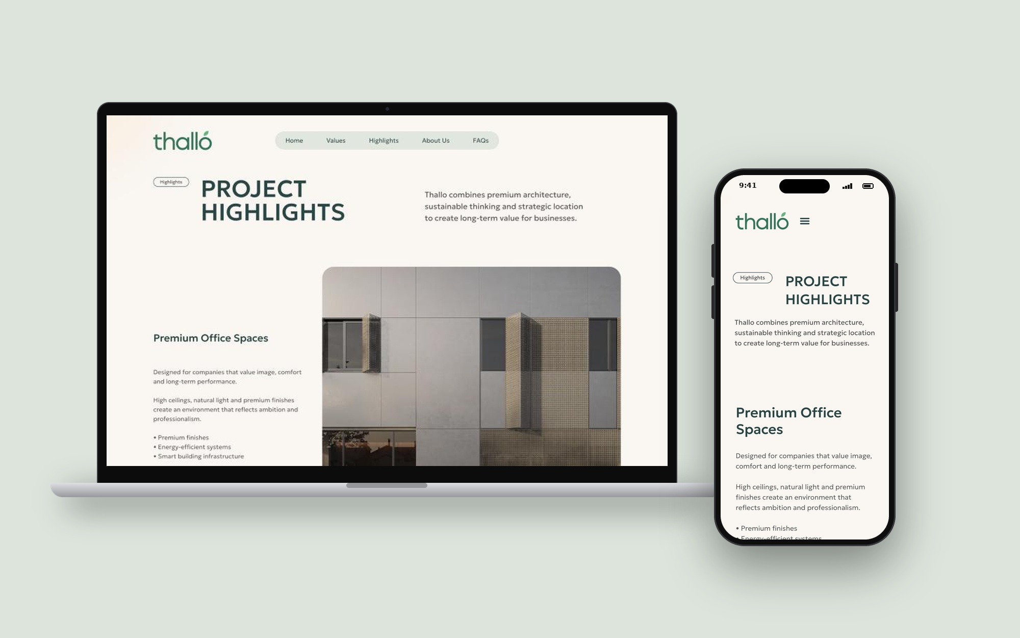
Mobile: anchor menu in a burger, cards and floor rows stack in one column.
Trade-off: one long page instead of several pages keeps the path to the form short, but needs clear section titles so visitors do not get lost.
Results
The design was reviewed with the client at wireframe stage and with the agency team before development, then checked on desktop, tablet and mobile. After launch, hero button clicks, "Book a Viewing" clicks per floor and form submissions are tracked, each linked to one hypothesis.
Learnings
When a building does not exist yet, clear numbers and good renders do most of the selling. Next steps: add interactive floor plans, a construction progress section with dated updates, and a short brochure download in exchange for an email.

Let’s design your next product - SaaS, fintech or e‑commerce.

BASED IN
London, UKLimassol, Cyprus
CONTACT
+44 7765 859993
+357 97 497860
yaroslavadzihim@gmail.com
SOCIAL
Behance
Yaroslava Dzihim
Yaroslava Dzihim
Thallo Building
Case Study
Thallo is a new green office building in Larnaca, Cyprus, developed by Studio Office. It offers 2,068 m² of flexible office space for growing companies and regional headquarters, with completion planned for 2027–2028. I designed the one-page website as a UI/UX designer with Absolute Websites.
Role: UI/UX Designer (freelance, with Absolute Websites)
Client: Thallo / Studio Office
Team: Absolute Websites
Timeline: 3 weeks of design, 2026
Scope: UX, information architecture, UI design, responsive design
Tools: Figma, FigJam
Website: thallobuilding.com
Problem
Thallo is still under construction, so there is no finished building to show. Companies looking for an office need to picture the space, understand what they can rent and decide if it is worth a viewing — all from renders and plans.
The audience is business owners and office managers from tech, finance, shipping and professional services. They compare several buildings and want facts quickly: location, size, features, timing.
How might we help a company understand the building and the available space in one visit, and make booking a viewing the natural next step?
Goals
- Explain what Thallo is in the first screen
- Show the building's features and sustainability clearly
- Make floor sizes easy to compare
- Answer common questions before visitors need to ask
- Turn interest into viewing requests
- Keep everything on one page that works well on mobile
Research
- Brief with the client and the Absolute Websites team: audience, key selling points, timeline
- Review of four office developments and business centres in Cyprus
- Content audit: renders, floor areas, building features, FAQs
- Page structure agreed with the client before wireframes
Main finding: companies choosing an office look for hard facts first — size, location, features, completion date. Lifestyle text matters less than clear numbers.
Audience: growing companies need flexible floors, regional headquarters want the whole building, and office managers care about practical features like parking, EV charging and climate control.
Hypotheses
H1. A short headline "Premium Offices in Larnaca" with a "Book a Meeting" button will explain the offer in the first screen. Measured by scroll depth and hero button clicks.
H2. Six building features shown as short cards will be easier to scan than long text. Measured by time spent on the features section.
H3. A floor-by-floor list with indoor, outdoor and total area will help companies find the right space. Measured by "Book a Viewing" clicks per floor.
H4. An FAQ section will answer common questions and reduce simple enquiries. Measured by FAQ opens and the share of enquiries asking the same questions.
H5. A short form with four fields will increase viewing requests. Measured by form submissions per 100 visits.
User flow
Main path: hero → project value → building features → floor specs → book a viewing.
Quick path: hero → "Book a Meeting" → contact form.
Sitemap: one page with anchor sections — Home, Values, Highlights, About Us, Specs, FAQs, Contact.
Solution
One-page structure: the site has a single job — get viewing requests — so all content sits on one page with anchor navigation.
Hero: "Premium Offices in Larnaca", a short tagline, a concept render and a "Book a Meeting" button.
Key facts row: floors, completion, green features and business access as short numbers under the intro.
Image gallery: interior renders help visitors picture the space before it is built.
Building features: six cards — smart building, modern architecture, solar energy, raised floors, energy-efficient HVAC, EV charging.
Specs: each floor listed with indoor, outdoor and total area, and a "Book a Viewing" button next to it.
FAQs: six short answers about timing, single-tenant leasing, the developer and the name.
Contact form: name, email, phone and message, with a "Book a Meeting" button.
Mobile: anchor menu in a burger, cards and floor rows stack in one column.
Trade-off: one long page instead of several pages keeps the path to the form short, but needs clear section titles so visitors do not get lost.
Results
The design was reviewed with the client at wireframe stage and with the agency team before development, then checked on desktop, tablet and mobile. After launch, hero button clicks, "Book a Viewing" clicks per floor and form submissions are tracked, each linked to one hypothesis.
Learnings
When a building does not exist yet, clear numbers and good renders do most of the selling. Next steps: add interactive floor plans, a construction progress section with dated updates, and a short brochure download in exchange for an email.

Let’s design your next product - SaaS, fintech or e‑commerce.

BASED IN
London, UKLimassol, Cyprus
CONTACT
+44 7765 859993
+357 97 497860
yaroslavadzihim@gmail.com
SOCIAL
Behance
Yaroslava Dzihim
Case Study
Thallo Building
Thallo is a new green office building in Larnaca, Cyprus, developed by Studio Office. It offers 2,068 m² of flexible office space for growing companies and regional headquarters, with completion planned for 2027–2028. I designed the one-page website as a UI/UX designer with Absolute Websites.
Role: UI/UX Designer (freelance, with Absolute Websites)
Client: Thallo / Studio Office
Team: Absolute Websites
Timeline: 3 weeks of design, 2026
Scope: UX, information architecture, UI design, responsive design
Tools: Figma, FigJam
Website: thallobuilding.com
Problem
Thallo is still under construction, so there is no finished building to show. Companies looking for an office need to picture the space, understand what they can rent and decide if it is worth a viewing — all from renders and plans.
The audience is business owners and office managers from tech, finance, shipping and professional services. They compare several buildings and want facts quickly: location, size, features, timing.
How might we help a company understand the building and the available space in one visit, and make booking a viewing the natural next step?
Goals
- Explain what Thallo is in the first screen
- Show the building's features and sustainability clearly
- Make floor sizes easy to compare
- Answer common questions before visitors need to ask
- Turn interest into viewing requests
- Keep everything on one page that works well on mobile
Research
- Brief with the client and the Absolute Websites team: audience, key selling points, timeline
- Review of four office developments and business centres in Cyprus
- Content audit: renders, floor areas, building features, FAQs
- Page structure agreed with the client before wireframes
Main finding: companies choosing an office look for hard facts first — size, location, features, completion date. Lifestyle text matters less than clear numbers.
Audience: growing companies need flexible floors, regional headquarters want the whole building, and office managers care about practical features like parking, EV charging and climate control.
Hypotheses
H1. A short headline "Premium Offices in Larnaca" with a "Book a Meeting" button will explain the offer in the first screen. Measured by scroll depth and hero button clicks.
H2. Six building features shown as short cards will be easier to scan than long text. Measured by time spent on the features section.
H3. A floor-by-floor list with indoor, outdoor and total area will help companies find the right space. Measured by "Book a Viewing" clicks per floor.
H4. An FAQ section will answer common questions and reduce simple enquiries. Measured by FAQ opens and the share of enquiries asking the same questions.
H5. A short form with four fields will increase viewing requests. Measured by form submissions per 100 visits.
User flow
Main path: hero → project value → building features → floor specs → book a viewing.
Quick path: hero → "Book a Meeting" → contact form.
Sitemap: one page with anchor sections — Home, Values, Highlights, About Us, Specs, FAQs, Contact.
Solution
One-page structure: the site has a single job — get viewing requests — so all content sits on one page with anchor navigation.
Hero: "Premium Offices in Larnaca", a short tagline, a concept render and a "Book a Meeting" button.
Key facts row: floors, completion, green features and business access as short numbers under the intro.
Image gallery: interior renders help visitors picture the space before it is built.
Building features: six cards — smart building, modern architecture, solar energy, raised floors, energy-efficient HVAC, EV charging.
Specs: each floor listed with indoor, outdoor and total area, and a "Book a Viewing" button next to it.
FAQs: six short answers about timing, single-tenant leasing, the developer and the name.
Contact form: name, email, phone and message, with a "Book a Meeting" button.
Mobile: anchor menu in a burger, cards and floor rows stack in one column.
Trade-off: one long page instead of several pages keeps the path to the form short, but needs clear section titles so visitors do not get lost.
Results
The design was reviewed with the client at wireframe stage and with the agency team before development, then checked on desktop, tablet and mobile. After launch, hero button clicks, "Book a Viewing" clicks per floor and form submissions are tracked, each linked to one hypothesis.
Learnings
When a building does not exist yet, clear numbers and good renders do most of the selling. Next steps: add interactive floor plans, a construction progress section with dated updates, and a short brochure download in exchange for an email.

Let’s design your next product - SaaS, fintech or e‑commerce.

BASED IN
London, UKLimassol, Cyprus
CONTACT
+44 7765 859993
+357 97 497860
yaroslavadzihim@gmail.com
SOCIAL
Behance
Yaroslava Dzihim