Pcela Flower
Case Study
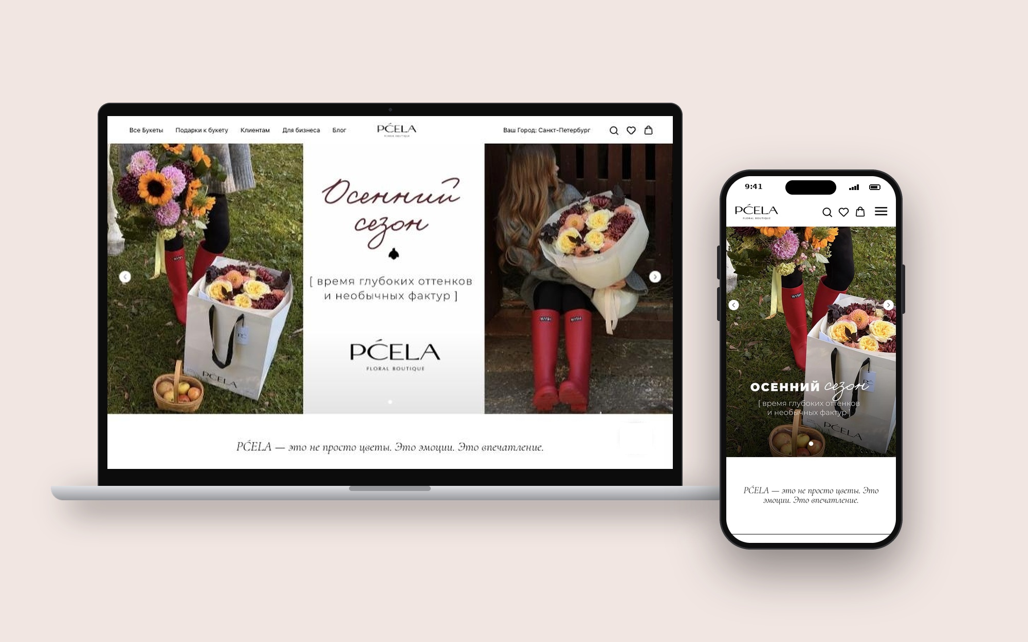
Pcela Flower is a flower delivery shop in St. Petersburg, with a second city in Novosibirsk. It sells bouquets, compositions and gifts, delivered by its own couriers within 90 minutes. I designed the e-commerce website as a freelance UI/UX designer.
Role: Product Designer
Client: Pcela Flower
Timeline: 4 weeks of design, 2025
Scope: UX, information architecture, UI design, responsive design, order flow
Platform: Tilda
Tools: Figma, FigJam
Website: pcela-flower.ru
Problem
Most people buy flowers in a hurry: a birthday, a date, an apology. They open the site on a phone and want to choose a bouquet, set a time and an address in a few minutes.
The shop has a wide range — bouquets, boxes, baskets, wedding flowers, premium sets and gifts — and many orders are sent to another person, sometimes anonymously. The site had to make this simple without hiding the range.
How might we help someone find the right bouquet and send it to another person quickly, on a phone, without calling the shop?
Goals
- Show the main selling points in the first screen: fast delivery, freshness, gift
- Help visitors browse bouquets by type, flower and occasion
- Make ordering for another person simple, including anonymous delivery
- Offer add-on gifts without slowing down the order
- Give quick contact through messengers and a callback
- Work well on mobile, where most orders are made
Research
- Brief with the client: best-selling products, typical orders, common customer questions
- Review of five flower delivery shops in St. Petersburg and Moscow
- Content audit: product photos, categories, gift add-ons, delivery rules
- Sitemap and order form fields agreed with the client before wireframes
Main finding: customers decide by photo and delivery time, not by product descriptions. Most of them are ordering for someone else and worry about timing and the recipient's details.
Audience: last-minute gift buyers need speed, people planning ahead want premium and seasonal bouquets, couples look for wedding flowers, and companies order regularly for clients and staff.
Hypotheses
H1. Three short promises in the hero — 90-minute delivery, 2-day freshness guarantee, a gift with larger orders — will build trust faster than long text. Measured by clicks into the catalogue from the first screen.
H2. Collections by flower and occasion (hydrangeas, sunflowers, bestsellers, weddings) will help visitors find a bouquet faster than one long list. Measured by collection clicks and time to first product view.
H3. An order form built around "who is it for" — me, another person or pickup — will reduce mistakes in recipient details. Measured by orders that need a follow-up call.
H4. Gift add-ons shown next to bouquets will raise the average order value. Measured by the share of orders with a card, chocolate or balloon.
H5. Messenger buttons and a 5-minute callback form will catch visitors who prefer to talk. Measured by messenger clicks and callback requests.
User flow
Main path: home → collection → bouquet → add a gift → order form (recipient, address, time) → manager confirms.
Quick path: home → messenger or callback → manager takes the order.
Gift hint: a visitor picks a bouquet and the shop sends a hint to the person who should buy it.
Sitemap: Home, All bouquets (by type and flower), Gifts, Weddings, For clients (delivery, loyalty, flower care), For business, Blog, Reviews, Contacts; city selector for St. Petersburg and Novosibirsk.
Solution
Hero: a short headline and three promises — delivery in 90 minutes, freshness guarantee, gift with larger orders.
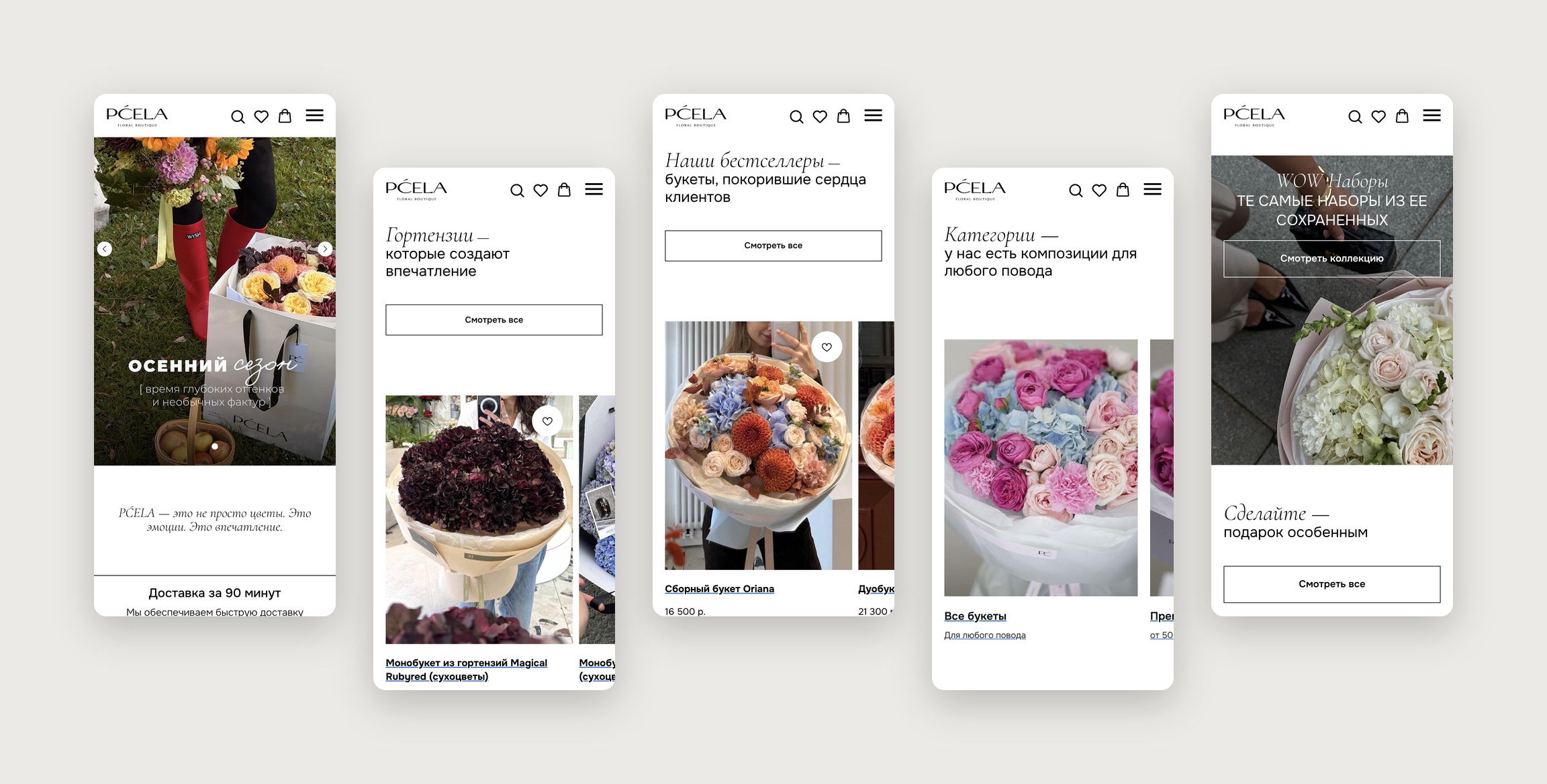
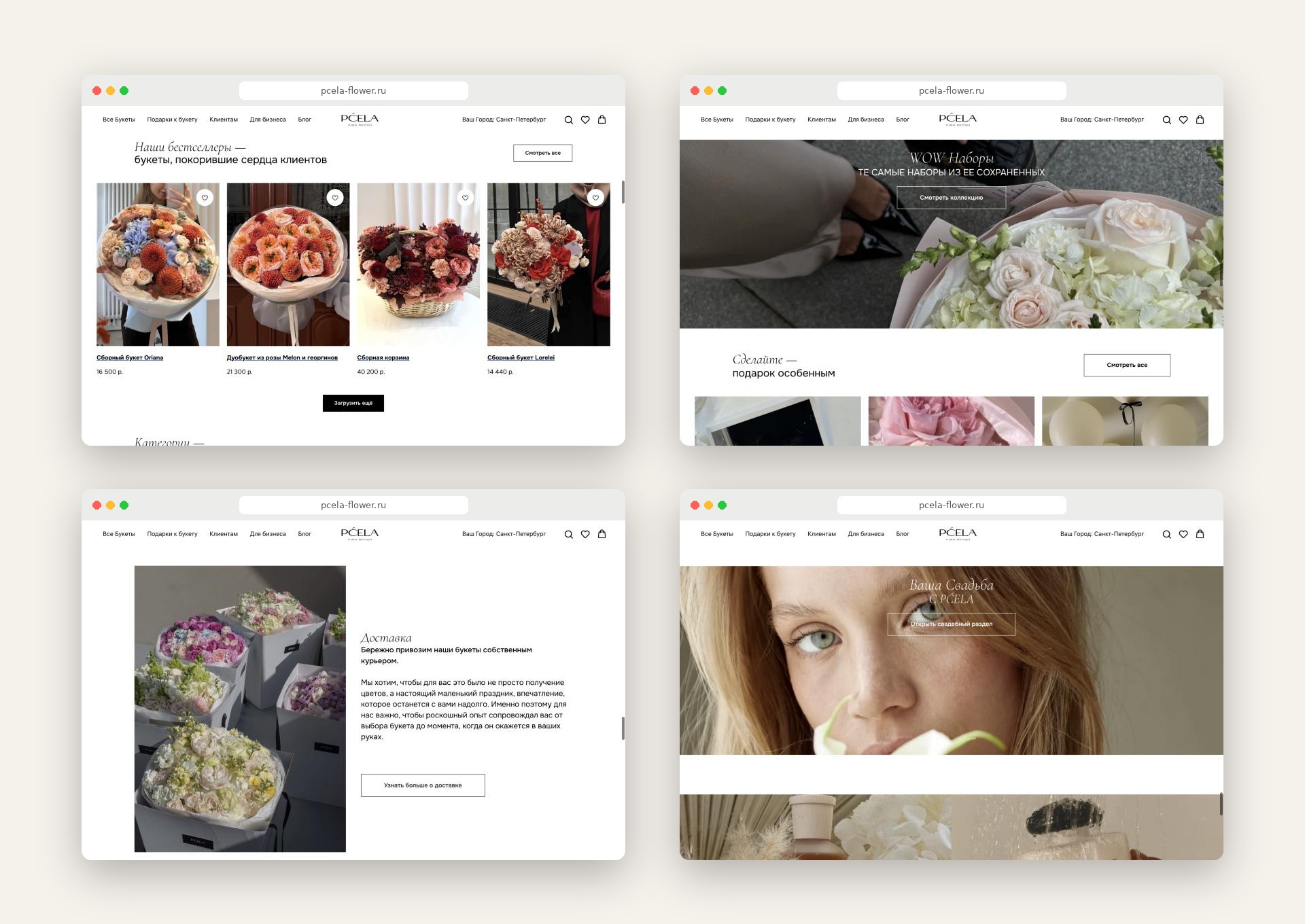
Collections: large photo cards for hydrangeas, sunflowers, bestsellers and bouquet types, each with "See all".
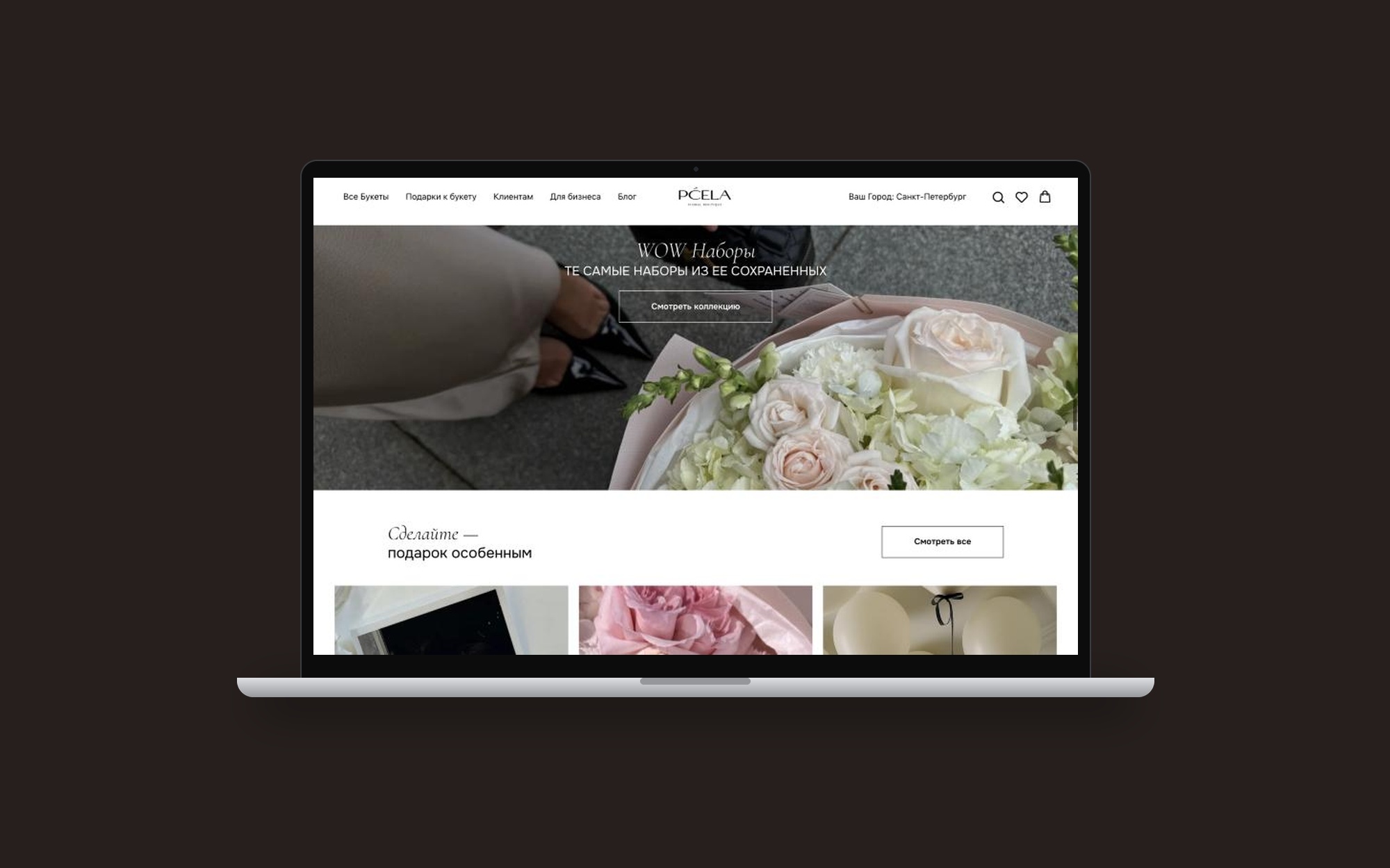
WOW sets and premium: separate blocks for bigger gifts, so they do not mix with everyday bouquets.
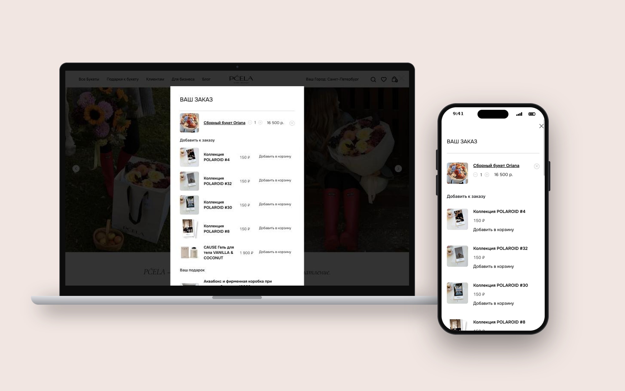
Gift add-ons: cards, chocolate, balloons and partner fragrances shown as a section of their own and offered with the order.
Order form: one form in clear steps — who it is for, recipient details, address, date and time slot, anonymous delivery, reminder for future holidays.
Quick contact: messenger buttons in the header, a call button and a callback form with a 5-minute promise.
Gift hint: a small form where a visitor chooses a bouquet and the shop hints to a partner or friend.
For clients: delivery terms, loyalty programme and flower care in one section.
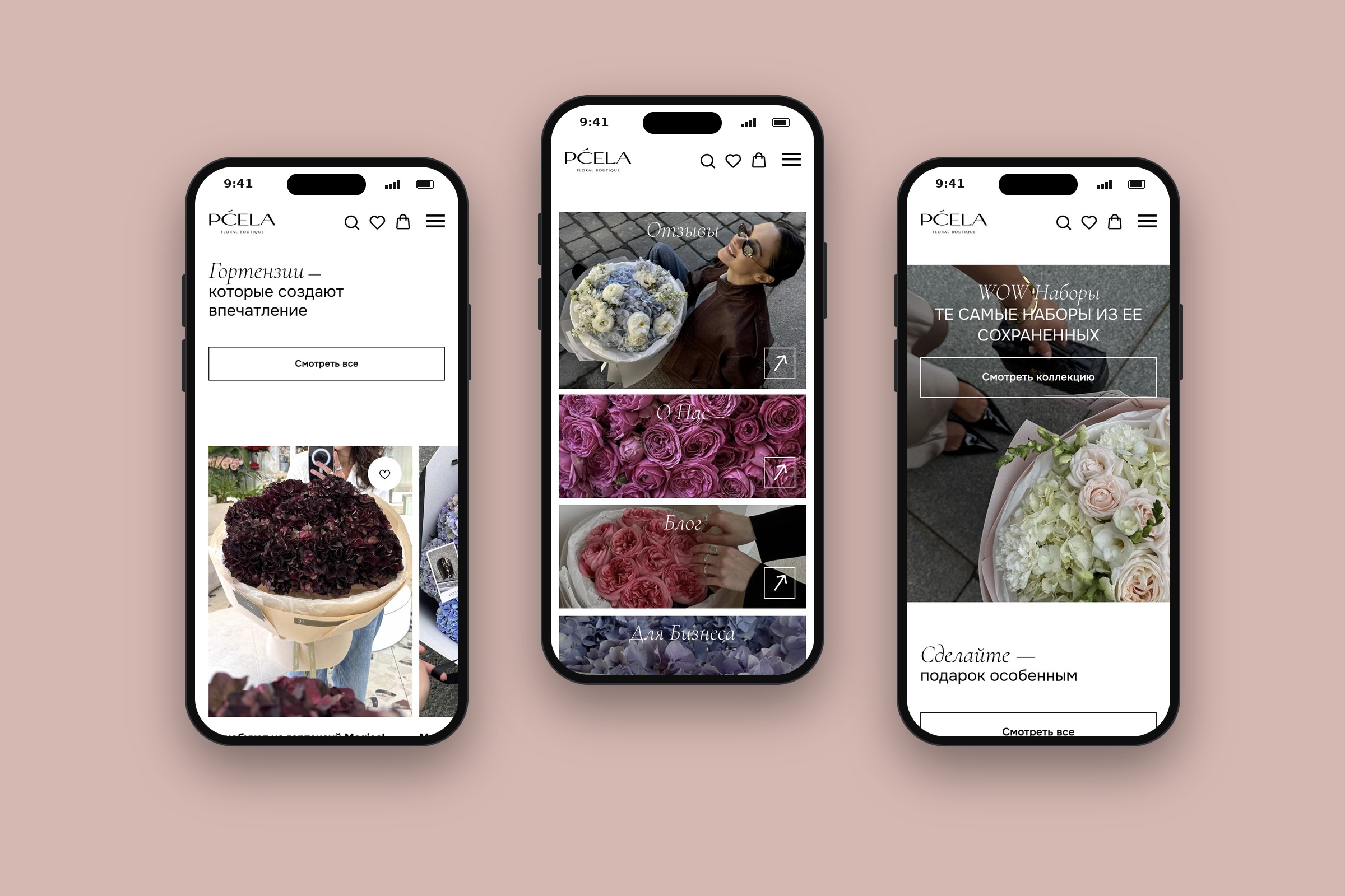
Mobile: sticky header with messengers and call, one-column cards, large tap areas in the form.
Trade-off: orders go through a form and a manager instead of a full online checkout. This keeps flexibility for custom bouquets and delivery fees, but adds a manual step.
Results
The design was reviewed with the client at wireframe and UI stages, then checked on desktop and mobile before launch. After launch, collection clicks, order form submissions, add-on share and messenger clicks are tracked, each linked to one hypothesis.
Learnings
In flower e-commerce, the photo sells and the form decides. A clear order form for sending to another person matters more than any decorative element. Next steps: show prices on product cards, add filters by price and occasion, add online payment, and use one delivery promise across the whole site.

Let’s design your next product - SaaS, fintech or e‑commerce.

BASED IN
London, UKLimassol, Cyprus
CONTACT
+44 7765 859993
+357 97 497860
yaroslavadzihim@gmail.com
SOCIAL
Behance
Yaroslava Dzihim
Yaroslava Dzihim
Pcela Flower
Case Study
Pcela Flower is a flower delivery shop in St. Petersburg, with a second city in Novosibirsk. It sells bouquets, compositions and gifts, delivered by its own couriers within 90 minutes. I designed the e-commerce website as a freelance UI/UX designer.
Role: Product Designer
Client: Pcela Flower
Timeline: 4 weeks of design, 2025
Scope: UX, information architecture, UI design, responsive design, order flow
Platform: Tilda
Tools: Figma, FigJam
Website: pcela-flower.ru
Problem
Most people buy flowers in a hurry: a birthday, a date, an apology. They open the site on a phone and want to choose a bouquet, set a time and an address in a few minutes.
The shop has a wide range — bouquets, boxes, baskets, wedding flowers, premium sets and gifts — and many orders are sent to another person, sometimes anonymously. The site had to make this simple without hiding the range.
How might we help someone find the right bouquet and send it to another person quickly, on a phone, without calling the shop?
Goals
- Show the main selling points in the first screen: fast delivery, freshness, gift
- Help visitors browse bouquets by type, flower and occasion
- Make ordering for another person simple, including anonymous delivery
- Offer add-on gifts without slowing down the order
- Give quick contact through messengers and a callback
- Work well on mobile, where most orders are made
Research
- Brief with the client: best-selling products, typical orders, common customer questions
- Review of five flower delivery shops in St. Petersburg and Moscow
- Content audit: product photos, categories, gift add-ons, delivery rules
- Sitemap and order form fields agreed with the client before wireframes
Main finding: customers decide by photo and delivery time, not by product descriptions. Most of them are ordering for someone else and worry about timing and the recipient's details.
Audience: last-minute gift buyers need speed, people planning ahead want premium and seasonal bouquets, couples look for wedding flowers, and companies order regularly for clients and staff.
Hypotheses
H1. Three short promises in the hero — 90-minute delivery, 2-day freshness guarantee, a gift with larger orders — will build trust faster than long text. Measured by clicks into the catalogue from the first screen.
H2. Collections by flower and occasion (hydrangeas, sunflowers, bestsellers, weddings) will help visitors find a bouquet faster than one long list. Measured by collection clicks and time to first product view.
H3. An order form built around "who is it for" — me, another person or pickup — will reduce mistakes in recipient details. Measured by orders that need a follow-up call.
H4. Gift add-ons shown next to bouquets will raise the average order value. Measured by the share of orders with a card, chocolate or balloon.
H5. Messenger buttons and a 5-minute callback form will catch visitors who prefer to talk. Measured by messenger clicks and callback requests.
User flow
Main path: home → collection → bouquet → add a gift → order form (recipient, address, time) → manager confirms.
Quick path: home → messenger or callback → manager takes the order.
Gift hint: a visitor picks a bouquet and the shop sends a hint to the person who should buy it.
Sitemap: Home, All bouquets (by type and flower), Gifts, Weddings, For clients (delivery, loyalty, flower care), For business, Blog, Reviews, Contacts; city selector for St. Petersburg and Novosibirsk.
Solution
Hero: a short headline and three promises — delivery in 90 minutes, freshness guarantee, gift with larger orders.
Collections: large photo cards for hydrangeas, sunflowers, bestsellers and bouquet types, each with "See all".
WOW sets and premium: separate blocks for bigger gifts, so they do not mix with everyday bouquets.
Gift add-ons: cards, chocolate, balloons and partner fragrances shown as a section of their own and offered with the order.
Order form: one form in clear steps — who it is for, recipient details, address, date and time slot, anonymous delivery, reminder for future holidays.
Quick contact: messenger buttons in the header, a call button and a callback form with a 5-minute promise.
Gift hint: a small form where a visitor chooses a bouquet and the shop hints to a partner or friend.
For clients: delivery terms, loyalty programme and flower care in one section.
Mobile: sticky header with messengers and call, one-column cards, large tap areas in the form.
Trade-off: orders go through a form and a manager instead of a full online checkout. This keeps flexibility for custom bouquets and delivery fees, but adds a manual step.
Results
The design was reviewed with the client at wireframe and UI stages, then checked on desktop and mobile before launch. After launch, collection clicks, order form submissions, add-on share and messenger clicks are tracked, each linked to one hypothesis.
Learnings
In flower e-commerce, the photo sells and the form decides. A clear order form for sending to another person matters more than any decorative element. Next steps: show prices on product cards, add filters by price and occasion, add online payment, and use one delivery promise across the whole site.

Let’s design your next product - SaaS, fintech or e‑commerce.

BASED IN
London, UKLimassol, Cyprus
CONTACT
+44 7765 859993
+357 97 497860
yaroslavadzihim@gmail.com
SOCIAL
Behance
Yaroslava Dzihim
Case Study
Pcela Flower
Pcela Flower is a flower delivery shop in St. Petersburg, with a second city in Novosibirsk. It sells bouquets, compositions and gifts, delivered by its own couriers within 90 minutes. I designed the e-commerce website as a freelance UI/UX designer.
Role: Product Designer
Client: Pcela Flower
Timeline: 4 weeks of design, 2025
Scope: UX, information architecture, UI design, responsive design, order flow
Platform: Tilda
Tools: Figma, FigJam
Website: pcela-flower.ru
Problem
Most people buy flowers in a hurry: a birthday, a date, an apology. They open the site on a phone and want to choose a bouquet, set a time and an address in a few minutes.
The shop has a wide range — bouquets, boxes, baskets, wedding flowers, premium sets and gifts — and many orders are sent to another person, sometimes anonymously. The site had to make this simple without hiding the range.
How might we help someone find the right bouquet and send it to another person quickly, on a phone, without calling the shop?
Goals
- Show the main selling points in the first screen: fast delivery, freshness, gift
- Help visitors browse bouquets by type, flower and occasion
- Make ordering for another person simple, including anonymous delivery
- Offer add-on gifts without slowing down the order
- Give quick contact through messengers and a callback
- Work well on mobile, where most orders are made
Research
- Brief with the client: best-selling products, typical orders, common customer questions
- Review of five flower delivery shops in St. Petersburg and Moscow
- Content audit: product photos, categories, gift add-ons, delivery rules
- Sitemap and order form fields agreed with the client before wireframes
Main finding: customers decide by photo and delivery time, not by product descriptions. Most of them are ordering for someone else and worry about timing and the recipient's details.
Audience: last-minute gift buyers need speed, people planning ahead want premium and seasonal bouquets, couples look for wedding flowers, and companies order regularly for clients and staff.
Hypotheses
H1. Three short promises in the hero — 90-minute delivery, 2-day freshness guarantee, a gift with larger orders — will build trust faster than long text. Measured by clicks into the catalogue from the first screen.
H2. Collections by flower and occasion (hydrangeas, sunflowers, bestsellers, weddings) will help visitors find a bouquet faster than one long list. Measured by collection clicks and time to first product view.
H3. An order form built around "who is it for" — me, another person or pickup — will reduce mistakes in recipient details. Measured by orders that need a follow-up call.
H4. Gift add-ons shown next to bouquets will raise the average order value. Measured by the share of orders with a card, chocolate or balloon.
H5. Messenger buttons and a 5-minute callback form will catch visitors who prefer to talk. Measured by messenger clicks and callback requests.
User flow
Main path: home → collection → bouquet → add a gift → order form (recipient, address, time) → manager confirms.
Quick path: home → messenger or callback → manager takes the order.
Gift hint: a visitor picks a bouquet and the shop sends a hint to the person who should buy it.
Sitemap: Home, All bouquets (by type and flower), Gifts, Weddings, For clients (delivery, loyalty, flower care), For business, Blog, Reviews, Contacts; city selector for St. Petersburg and Novosibirsk.
Solution
Hero: a short headline and three promises — delivery in 90 minutes, freshness guarantee, gift with larger orders.
Collections: large photo cards for hydrangeas, sunflowers, bestsellers and bouquet types, each with "See all".
WOW sets and premium: separate blocks for bigger gifts, so they do not mix with everyday bouquets.
Gift add-ons: cards, chocolate, balloons and partner fragrances shown as a section of their own and offered with the order.
Order form: one form in clear steps — who it is for, recipient details, address, date and time slot, anonymous delivery, reminder for future holidays.
Quick contact: messenger buttons in the header, a call button and a callback form with a 5-minute promise.
Gift hint: a small form where a visitor chooses a bouquet and the shop hints to a partner or friend.
For clients: delivery terms, loyalty programme and flower care in one section.
Mobile: sticky header with messengers and call, one-column cards, large tap areas in the form.
Trade-off: orders go through a form and a manager instead of a full online checkout. This keeps flexibility for custom bouquets and delivery fees, but adds a manual step.
Results
The design was reviewed with the client at wireframe and UI stages, then checked on desktop and mobile before launch. After launch, collection clicks, order form submissions, add-on share and messenger clicks are tracked, each linked to one hypothesis.
Learnings
In flower e-commerce, the photo sells and the form decides. A clear order form for sending to another person matters more than any decorative element. Next steps: show prices on product cards, add filters by price and occasion, add online payment, and use one delivery promise across the whole site.

Let’s design your next product - SaaS, fintech or e‑commerce.

BASED IN
London, UKLimassol, Cyprus
CONTACT
+44 7765 859993
+357 97 497860
yaroslavadzihim@gmail.com
SOCIAL
Behance
Yaroslava Dzihim