JBC Projects (James Bradshaw Consulting), London and Cardiff
Case Study
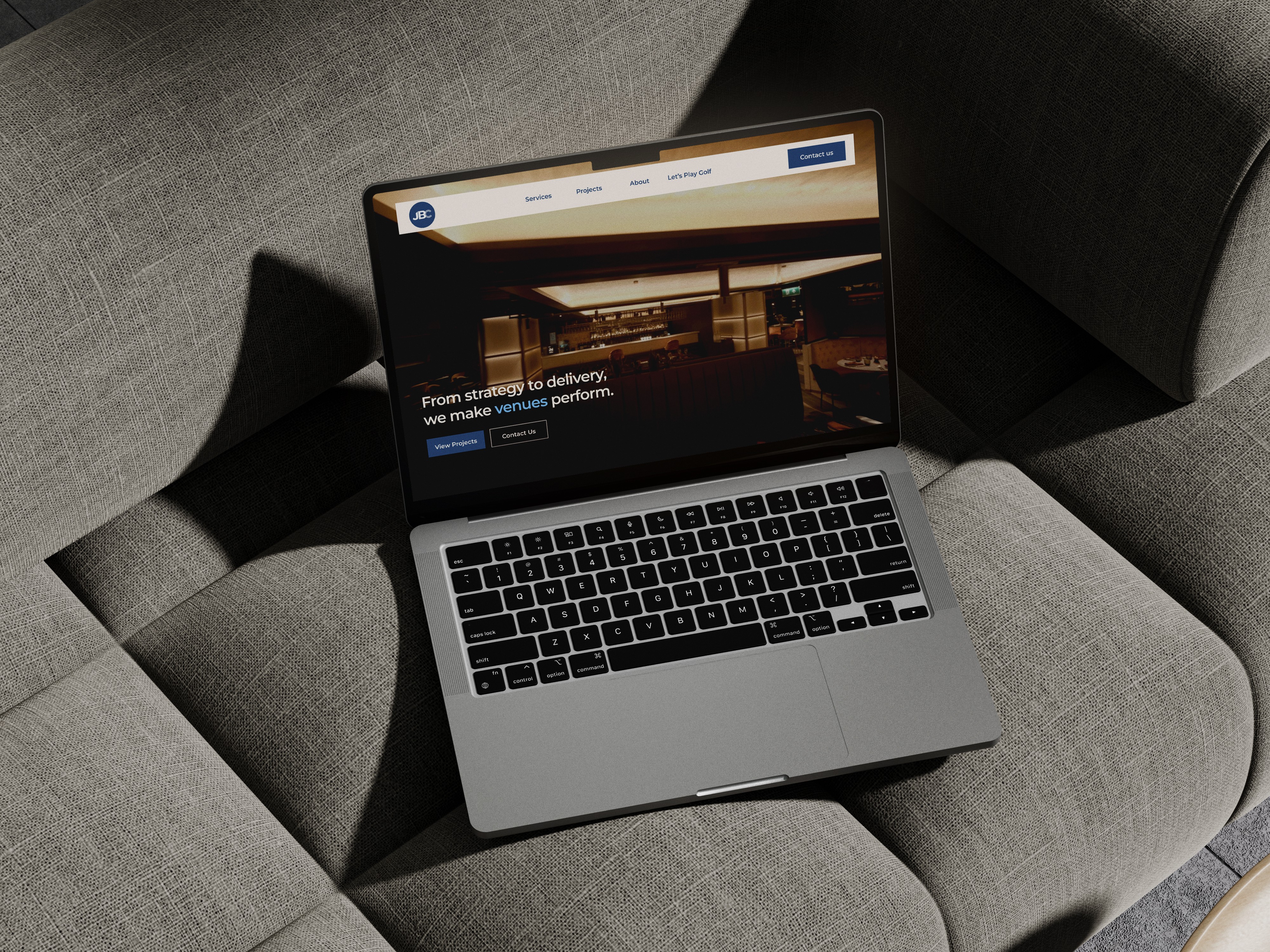
JBC Projects is a London and Cardiff consultancy that advises on stadium, arena and venue projects across the UK and Europe, including Ziggo Dome, OVO Arena Wembley and AO Arena.
I worked on the new website as a freelance UI/UX designer with Absolute Websites. The goal was to make the firm’s experience easy to check: who they are, what services they offer, which venues they have worked on, and how to get in touch.
The site is built around the projects. Client logos and venue case studies come first, the three services are clearly separated, and a direct contact is available from every page.
Client: JBC Projects (James Bradshaw Consulting), London and Cardiff
Industry: Stadium, arena and venue development consultancy
Audience: Venue operators, investors, developers, rightsholders, public sector
My role: UI/UX Designer with Absolute Websites
Team: Absolute Websites (agency)
Timeline: 4 weeks of design, 2026
Platform: Responsive marketing website (desktop, tablet, mobile)
Tools: Figma, FigJam
Website: jbcprojects.com

Problem
JBC's clients are venue owners, operators and investors planning large, long-term projects. Before getting in touch, they use the website to check one thing: has this firm delivered a project like mine?
The firm's experience was not presented in one clear place, so that answer was hard to find.
How might we help visitors confirm JBC's experience in one visit and make contacting the firm the obvious next step?
Goals
- Show relevant experience in the first screens
- Make projects easy to find and browse
- Make the three services easy to tell apart
- Increase enquiries from the right clients
- Work well on every device
Research
- Brief with the client and the Absolute Websites team: audience, key projects, priorities
- Review of four venue and sports consultancies
- Content audit: projects, client logos, photography
- Sitemap and content priorities agreed before wireframes
Main finding: clients choose a venue consultant mainly on its past projects and clients; the service list comes second.
Audience: venue operators look for operating experience, investors and developers for budget and timeline control, public sector clients for an established, credible supplier.
Hypotheses
H1. Client logos in the hero will build trust faster. Measured by the share of visitors who scroll to Projects.
H2. Projects on the homepage will help visitors find relevant experience. Measured by project card clicks per session.
H3. Three clearly separated services will help buyers find the right one. Measured by service page views.
H4. A repeated "Let's talk" call to action will increase enquiries. Measured by contact clicks per 100 visits.
H5. A direct email instead of a long form will lower the effort to get in touch. Measured by enquiries started.
User flow
Main path: referral or search → homepage → projects → project page → contact. Services sit one step from the homepage and also lead to contact.
Sitemap: Home, Services, Projects, About, Newsroom, Contact.
Solution
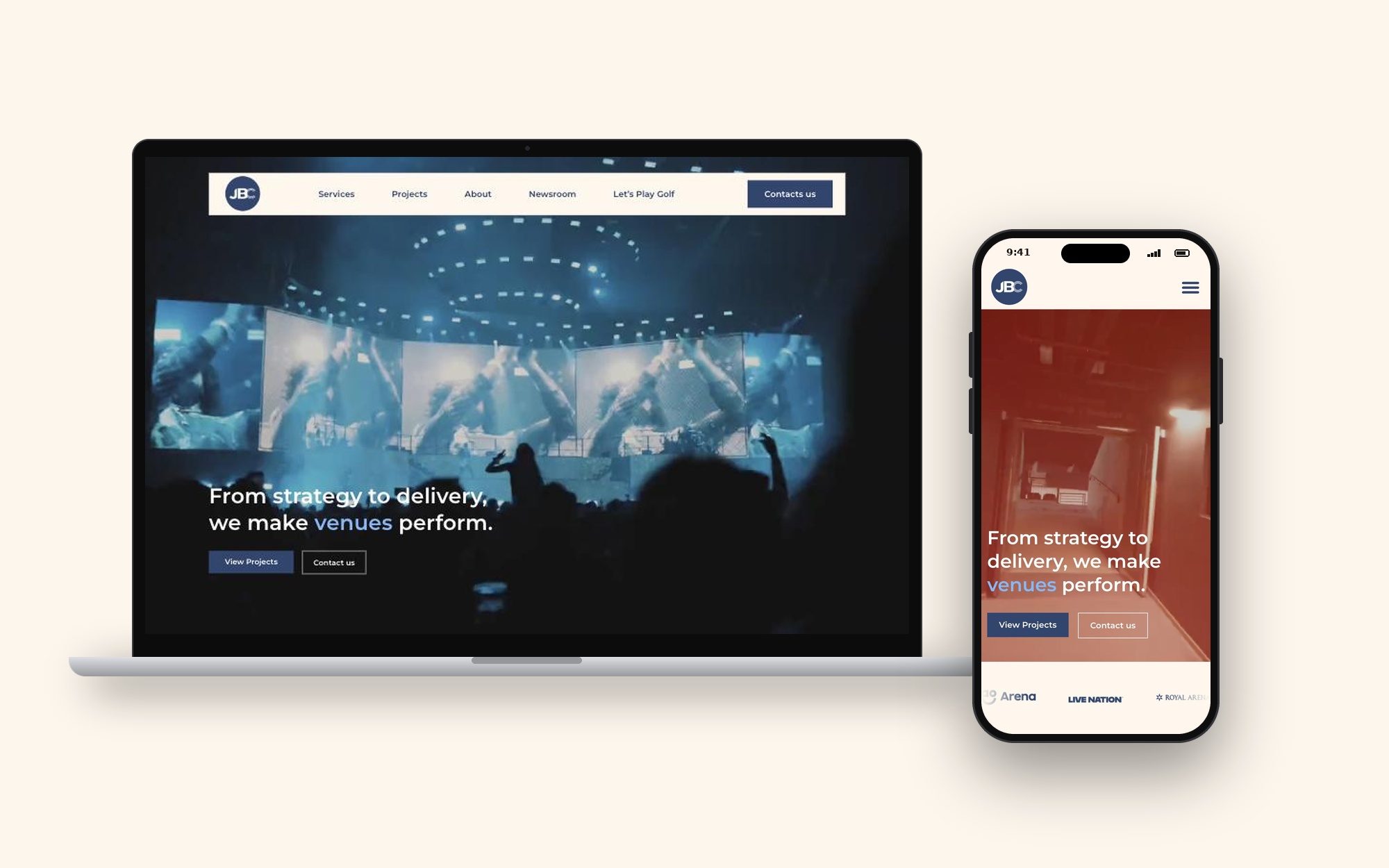
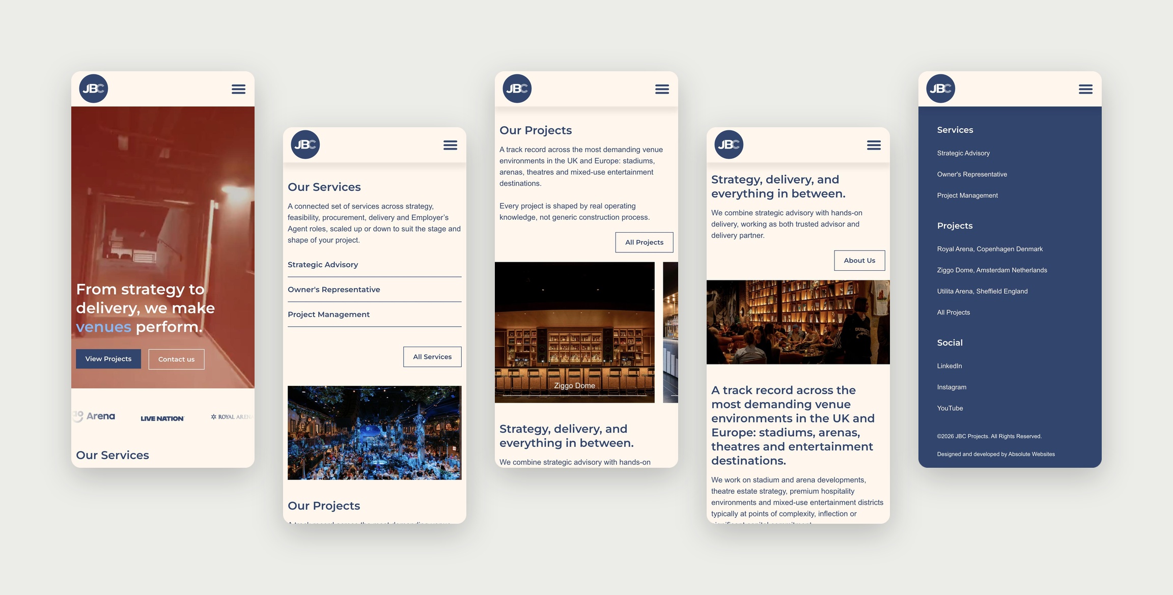
Hero with client logos: tagline, two calls to action and a logo strip, so visitors see recognisable clients first.
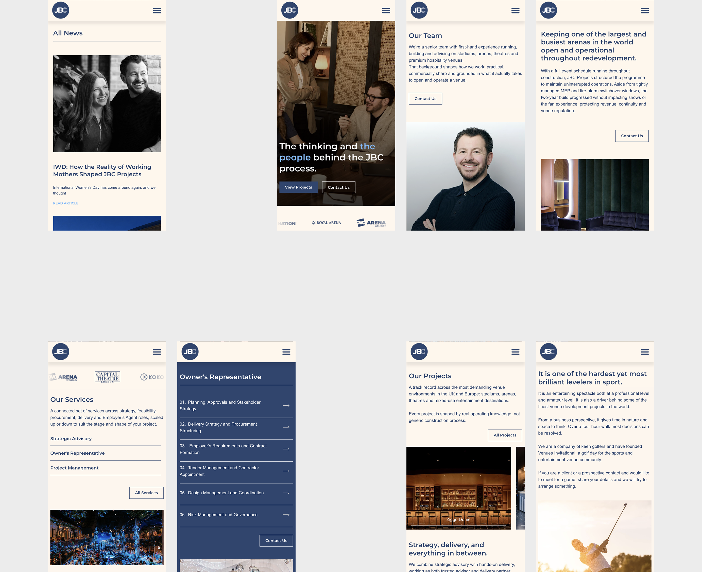
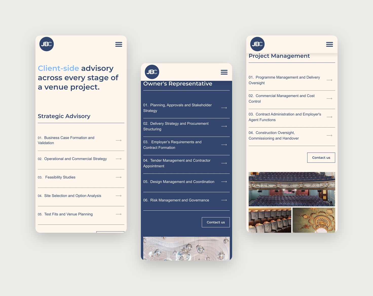
Services as three cards: Strategic Advisory, Owner's Representative and Project Management, one line each.
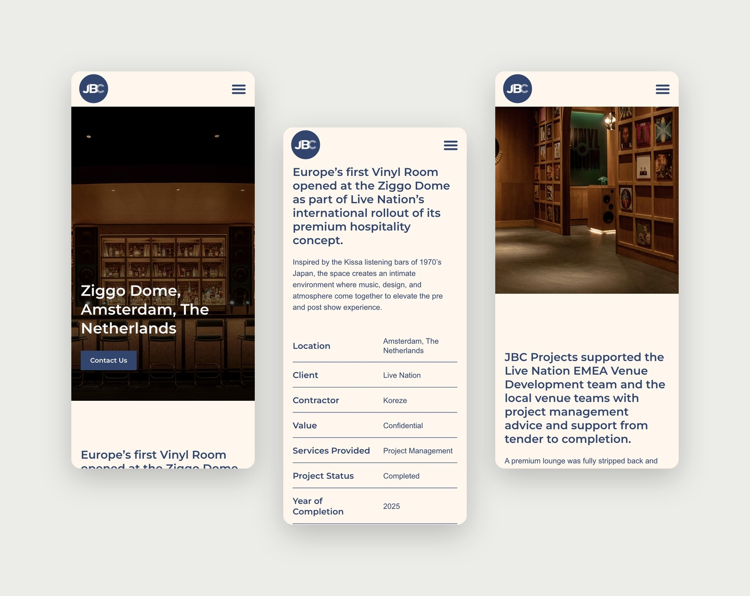
Projects on the homepage: six cards with venue name, city and a large photo.
About block: shows JBC's operating background, not only construction.
Closing call to action: "Got a project in mind? Let's talk." at the end of the page.
Footer as second navigation: services, featured projects and a direct email.
Visual style: large venue photography, a restrained palette and simple sans-serif type.
Mobile: menu navigation, one-column cards, contact at the end of key sections.
Trade-off: a direct email instead of a form gives less structured lead data, but a lower barrier for senior buyers.
Results
The design was reviewed with the client at wireframe stage and with the agency team before development, then checked on desktop, tablet and mobile. After launch, contact clicks, project page views and mobile bounce rate are tracked, each linked to one hypothesis.
Learnings
For B2B services, clear project information matters more than visual effects. Next steps: filter projects by venue type, add key facts to project cards (capacity, opening year), and add a short enquiry form with a project-stage field.

Let’s design your next product - SaaS, fintech or e‑commerce.

BASED IN
London, UKLimassol, Cyprus
CONTACT
+44 7765 859993
+357 97 497860
yaroslavadzihim@gmail.com
SOCIAL
Behance
Yaroslava Dzihim
Yaroslava Dzihim
JBC Projects (James Bradshaw Consulting), London and Cardiff
Case Study
JBC Projects is a London and Cardiff consultancy that advises on stadium, arena and venue projects across the UK and Europe, including Ziggo Dome, OVO Arena Wembley and AO Arena.
I worked on the new website as a freelance UI/UX designer with Absolute Websites. The goal was to make the firm’s experience easy to check: who they are, what services they offer, which venues they have worked on, and how to get in touch.
The site is built around the projects. Client logos and venue case studies come first, the three services are clearly separated, and a direct contact is available from every page.
Client: JBC Projects (James Bradshaw Consulting), London and Cardiff
Industry: Stadium, arena and venue development consultancy
Audience: Venue operators, investors, developers, rightsholders, public sector
My role: UI/UX Designer with Absolute Websites
Team: Absolute Websites (agency)
Timeline: 4 weeks of design, 2026
Platform: Responsive marketing website (desktop, tablet, mobile)
Tools: Figma, FigJam
Website: jbcprojects.com
Problem
JBC's clients are venue owners, operators and investors planning large, long-term projects. Before getting in touch, they use the website to check one thing: has this firm delivered a project like mine?
The firm's experience was not presented in one clear place, so that answer was hard to find.
How might we help visitors confirm JBC's experience in one visit and make contacting the firm the obvious next step?
Goals
- Show relevant experience in the first screens
- Make projects easy to find and browse
- Make the three services easy to tell apart
- Increase enquiries from the right clients
- Work well on every device
Research
- Brief with the client and the Absolute Websites team: audience, key projects, priorities
- Review of four venue and sports consultancies
- Content audit: projects, client logos, photography
- Sitemap and content priorities agreed before wireframes
Main finding: clients choose a venue consultant mainly on its past projects and clients; the service list comes second.
Audience: venue operators look for operating experience, investors and developers for budget and timeline control, public sector clients for an established, credible supplier.
Hypotheses
H1. Client logos in the hero will build trust faster. Measured by the share of visitors who scroll to Projects.
H2. Projects on the homepage will help visitors find relevant experience. Measured by project card clicks per session.
H3. Three clearly separated services will help buyers find the right one. Measured by service page views.
H4. A repeated "Let's talk" call to action will increase enquiries. Measured by contact clicks per 100 visits.
H5. A direct email instead of a long form will lower the effort to get in touch. Measured by enquiries started.
User flow
Main path: referral or search → homepage → projects → project page → contact. Services sit one step from the homepage and also lead to contact.
Sitemap: Home, Services, Projects, About, Newsroom, Contact.
Solution
Hero with client logos: tagline, two calls to action and a logo strip, so visitors see recognisable clients first.
Services as three cards: Strategic Advisory, Owner's Representative and Project Management, one line each.
Projects on the homepage: six cards with venue name, city and a large photo.
About block: shows JBC's operating background, not only construction.
Closing call to action: "Got a project in mind? Let's talk." at the end of the page.
Footer as second navigation: services, featured projects and a direct email.
Visual style: large venue photography, a restrained palette and simple sans-serif type.
Mobile: menu navigation, one-column cards, contact at the end of key sections.
Trade-off: a direct email instead of a form gives less structured lead data, but a lower barrier for senior buyers.
Results
The design was reviewed with the client at wireframe stage and with the agency team before development, then checked on desktop, tablet and mobile. After launch, contact clicks, project page views and mobile bounce rate are tracked, each linked to one hypothesis.
Learnings
For B2B services, clear project information matters more than visual effects. Next steps: filter projects by venue type, add key facts to project cards (capacity, opening year), and add a short enquiry form with a project-stage field.

Let’s design your next product - SaaS, fintech or e‑commerce.

BASED IN
London, UKLimassol, Cyprus
CONTACT
+44 7765 859993
+357 97 497860
yaroslavadzihim@gmail.com
SOCIAL
Behance
Yaroslava Dzihim
Case Study
JBC Projects (James Bradshaw Consulting), London and Cardiff
JBC Projects is a London and Cardiff consultancy that advises on stadium, arena and venue projects across the UK and Europe, including Ziggo Dome, OVO Arena Wembley and AO Arena.
I worked on the new website as a freelance UI/UX designer with Absolute Websites. The goal was to make the firm’s experience easy to check: who they are, what services they offer, which venues they have worked on, and how to get in touch.
The site is built around the projects. Client logos and venue case studies come first, the three services are clearly separated, and a direct contact is available from every page.
Client: JBC Projects (James Bradshaw Consulting), London and Cardiff
Industry: Stadium, arena and venue development consultancy
Audience: Venue operators, investors, developers, rightsholders, public sector
My role: UI/UX Designer with Absolute Websites
Team: Absolute Websites (agency)
Timeline: 4 weeks of design, 2026
Platform: Responsive marketing website (desktop, tablet, mobile)
Tools: Figma, FigJam
Website: jbcprojects.com
Problem
JBC's clients are venue owners, operators and investors planning large, long-term projects. Before getting in touch, they use the website to check one thing: has this firm delivered a project like mine?
The firm's experience was not presented in one clear place, so that answer was hard to find.
How might we help visitors confirm JBC's experience in one visit and make contacting the firm the obvious next step?
Goals
- Show relevant experience in the first screens
- Make projects easy to find and browse
- Make the three services easy to tell apart
- Increase enquiries from the right clients
- Work well on every device
Research
- Brief with the client and the Absolute Websites team: audience, key projects, priorities
- Review of four venue and sports consultancies
- Content audit: projects, client logos, photography
- Sitemap and content priorities agreed before wireframes
Main finding: clients choose a venue consultant mainly on its past projects and clients; the service list comes second.
Audience: venue operators look for operating experience, investors and developers for budget and timeline control, public sector clients for an established, credible supplier.
Hypotheses
H1. Client logos in the hero will build trust faster. Measured by the share of visitors who scroll to Projects.
H2. Projects on the homepage will help visitors find relevant experience. Measured by project card clicks per session.
H3. Three clearly separated services will help buyers find the right one. Measured by service page views.
H4. A repeated "Let's talk" call to action will increase enquiries. Measured by contact clicks per 100 visits.
H5. A direct email instead of a long form will lower the effort to get in touch. Measured by enquiries started.
User flow
Main path: referral or search → homepage → projects → project page → contact. Services sit one step from the homepage and also lead to contact.
Sitemap: Home, Services, Projects, About, Newsroom, Contact.
Solution
Hero with client logos: tagline, two calls to action and a logo strip, so visitors see recognisable clients first.
Services as three cards: Strategic Advisory, Owner's Representative and Project Management, one line each.
Projects on the homepage: six cards with venue name, city and a large photo.
About block: shows JBC's operating background, not only construction.
Closing call to action: "Got a project in mind? Let's talk." at the end of the page.
Footer as second navigation: services, featured projects and a direct email.
Visual style: large venue photography, a restrained palette and simple sans-serif type.
Mobile: menu navigation, one-column cards, contact at the end of key sections.
Trade-off: a direct email instead of a form gives less structured lead data, but a lower barrier for senior buyers.
Results
The design was reviewed with the client at wireframe stage and with the agency team before development, then checked on desktop, tablet and mobile. After launch, contact clicks, project page views and mobile bounce rate are tracked, each linked to one hypothesis.
Learnings
For B2B services, clear project information matters more than visual effects. Next steps: filter projects by venue type, add key facts to project cards (capacity, opening year), and add a short enquiry form with a project-stage field.

Let’s design your next product - SaaS, fintech or e‑commerce.

BASED IN
London, UKLimassol, Cyprus
CONTACT
+44 7765 859993
+357 97 497860
yaroslavadzihim@gmail.com
SOCIAL
Behance
Yaroslava Dzihim