Andreas Dalitis & Sons
Case Study
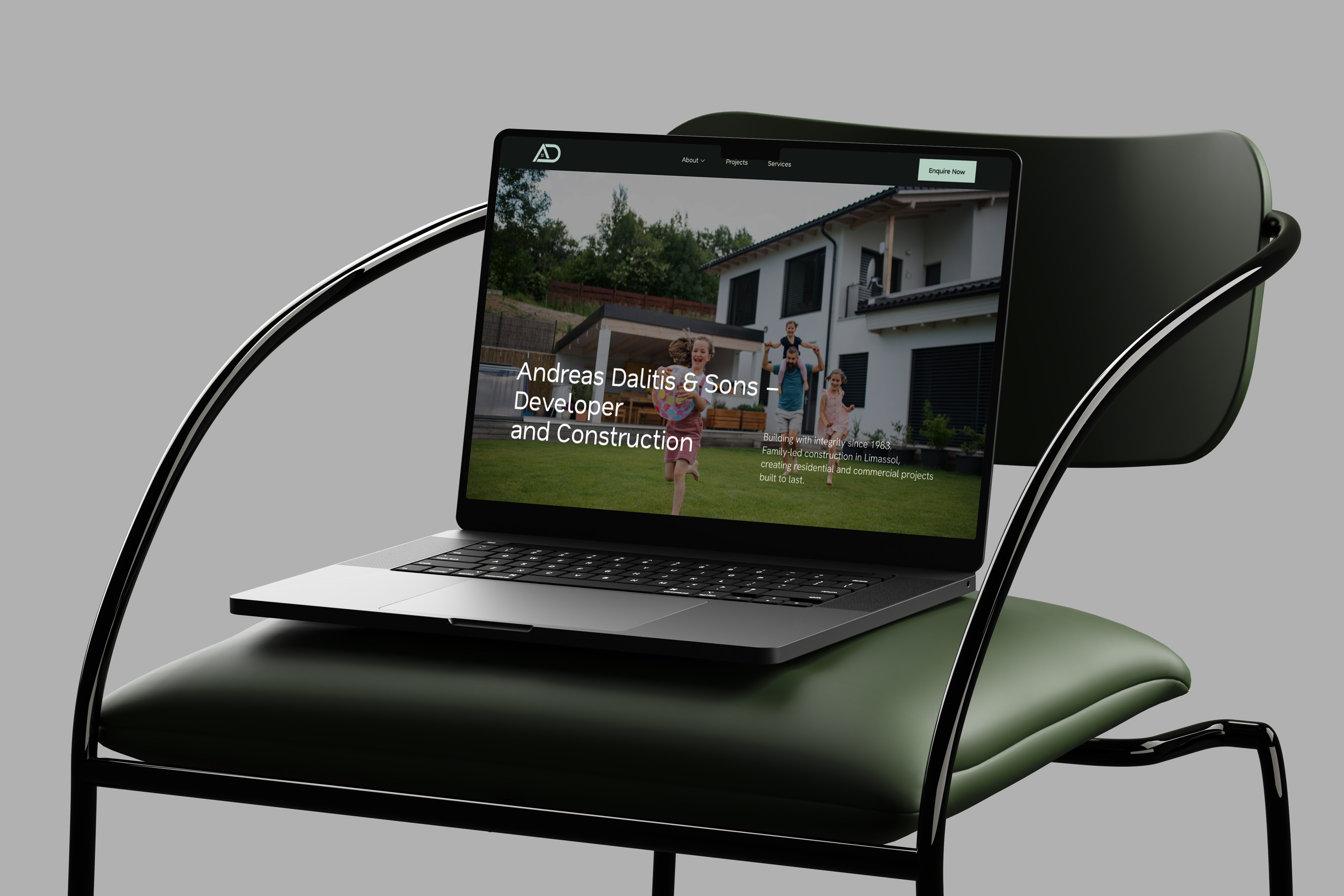
Andreas Dalitis & Sons is a family-led construction and property development company in Limassol, Cyprus, working since 1983. It builds residential and commercial projects and sells new developments, including off-plan. I designed the new website as a freelance UI/UX designer with Absolute Websites.
Role: UI/UX Designer (freelance, with Absolute Websites)
Client: Andreas Dalitis & Sons
Team: Absolute Websites
Timeline: 3 weeks of design, 2026
Scope: UX, information architecture, UI design, responsive design
Tools: Figma, FigJam
Website: andreasdalitis.com.cy
Problem
The company's audience is wide: homebuyers, property investors and businesses looking for commercial space. Each group comes with a different question. A buyer wants to see what is for sale now, an investor wants proof of past projects, and a business wants to know if the company can build for them.
The website had to answer all three without becoming cluttered, and show 40 years of work as a reason to trust a new development.
How might we help each visitor find what is relevant to them quickly, and turn interest in a development into an enquiry?
Goals
- Put developments for sale at the top of the homepage
- Show completed projects as proof of quality
- Present seven services clearly without overwhelming the page
- Make an enquiry possible from every page
- Collect enquiries that are easy for the sales team to sort
- Work well on mobile, where most property browsing happens
Research
- Brief with the client and the Absolute Websites team: audience, current developments, priorities
- Review of four Cyprus developers and construction companies
- Content audit: projects, photography, service descriptions, contact channels
- Sitemap and content priorities agreed before wireframes
Main finding: visitors look for a specific development first and read about the company second. Trust comes from finished buildings, not from long text.
Audience: homebuyers look for available homes and locations, investors for track record and long-term value, businesses for commercial building experience.
Hypotheses
H1. Showing the development for sale right after the hero will bring more buyers to its page. Measured by clicks on "View Project".
H2. Completed projects on the homepage will build trust in new developments. Measured by views of completed project pages.
H3. Key facts in short form (since 1983, family-led, full cycle) will make the company's experience clear at a glance. Measured by scroll depth past the stats bar.
H4. An "Enquire Now" button in the header will increase enquiries from any page. Measured by enquiries per 100 visits.
H5. A "Project type" field in the form will help the sales team reply faster. Measured by the share of enquiries with a project type selected.
User flow
Buyer path: homepage → development for sale → project page → enquiry form.
Investor path: homepage → completed projects → about → enquiry form.
Business path: homepage → services → enquiry form.
Sitemap: Home, About, Projects, Services, Contact.
Solution
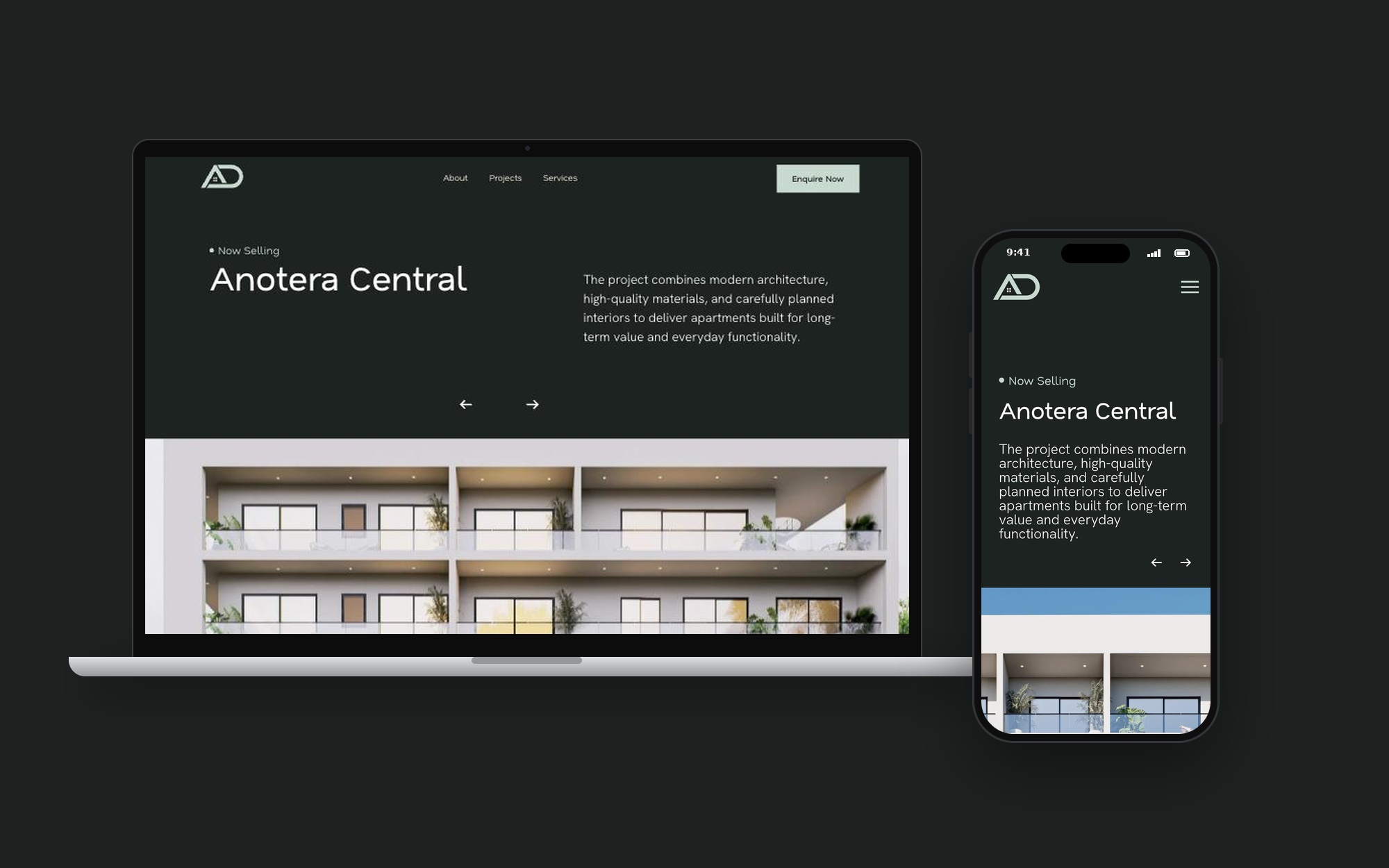
Hero: the tagline "Building with integrity since 1983" and a short introduction set the tone in one screen.
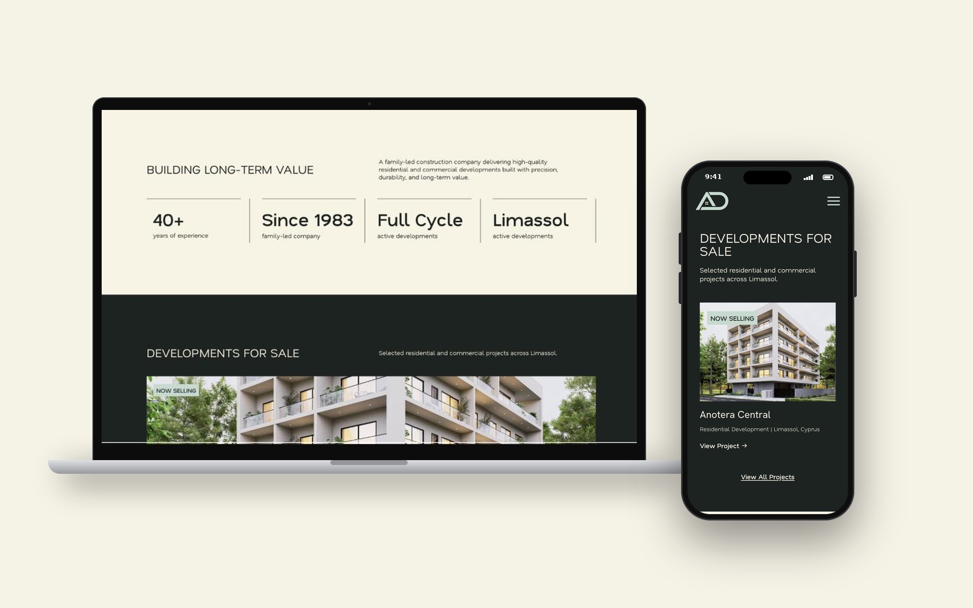
Stats bar: years of experience, family-led, full cycle and Limassol as short facts instead of a paragraph.
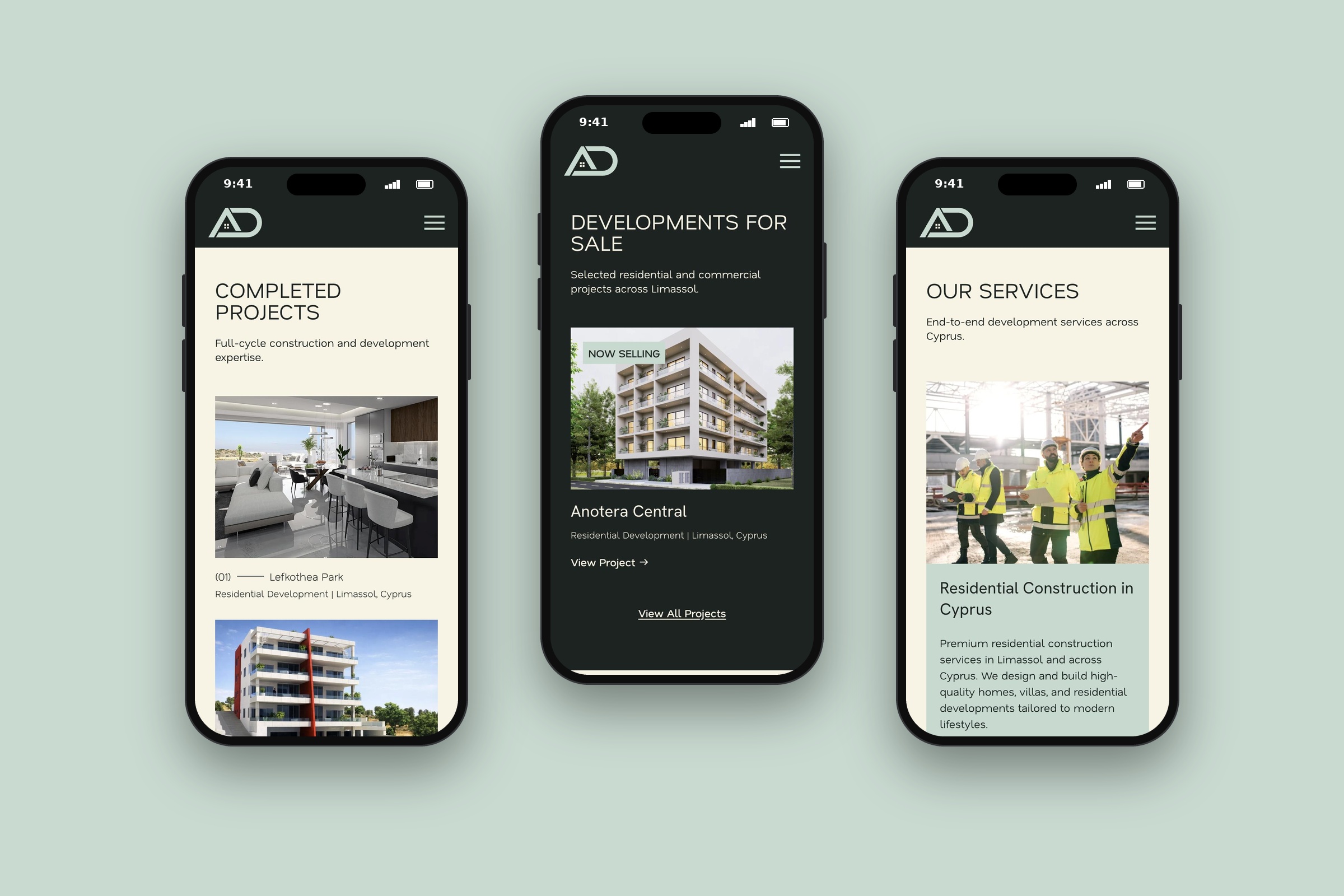
Developments for sale: Anotera Central placed right after the intro with a "Now Selling" label and a direct link to the project.
Completed projects: Lefkothea Park and Lefkothea Residence as proof of finished work.
Developing with purpose: four short points — location, architecture, construction quality, long-term value — that explain how the company works.
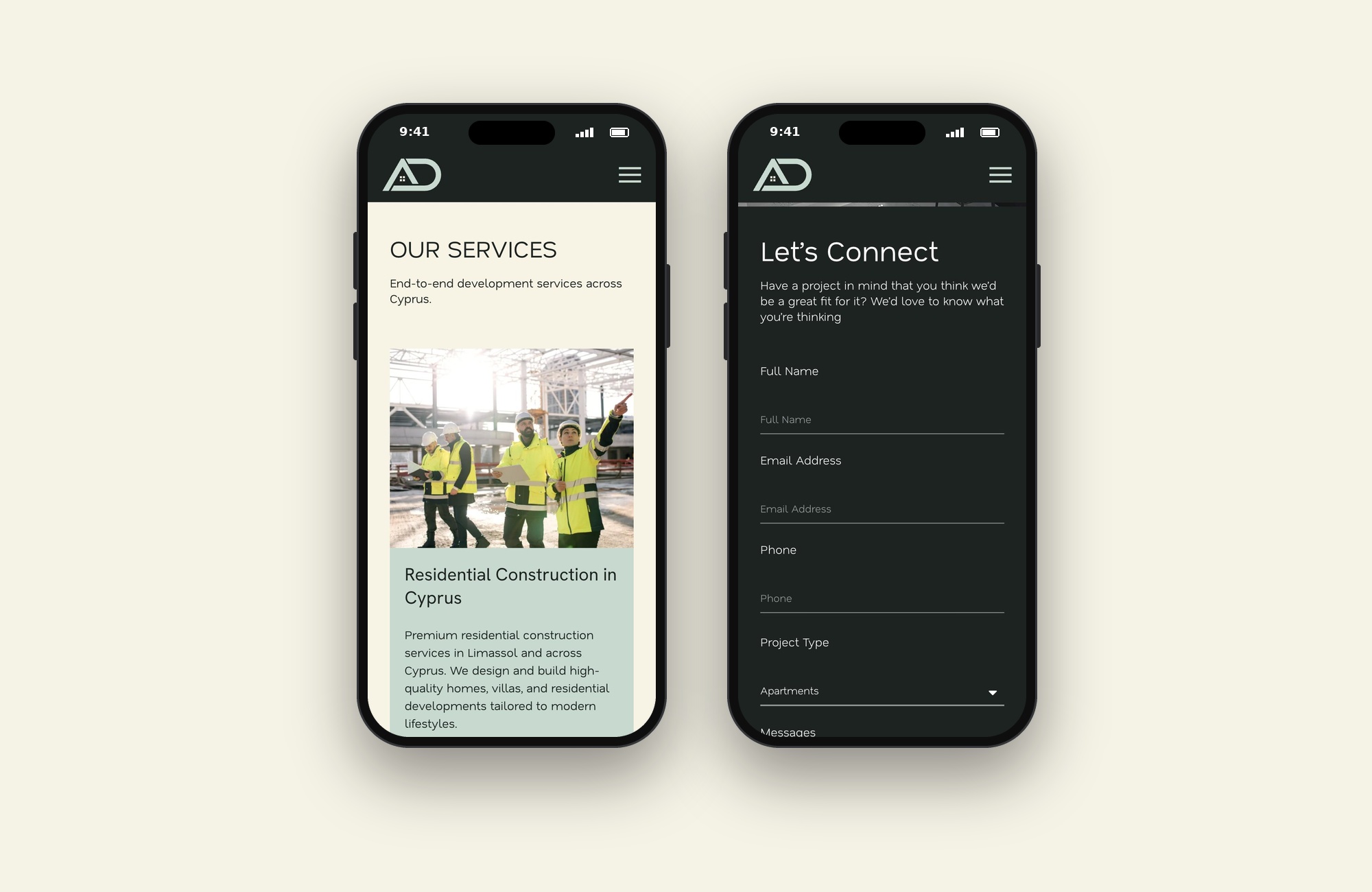
Services: seven services in one section, each with a short description, so visitors can scan them quickly.
Enquiry form: name, email, phone, project type and message, next to a map of the office.
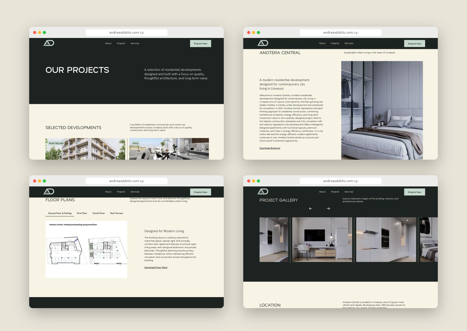
Enquire Now: a button in the header on every page.
Mobile: off-canvas menu, one-column sections, form fields sized for touch.
Trade-off: one featured development on the homepage keeps the focus clear, while all others live on the Projects page.
Results
The design was reviewed with the client at wireframe stage and with the agency team before development, then checked on desktop, tablet and mobile. After launch, clicks on developments for sale, enquiries per visit and the share of enquiries with a project type are tracked, each linked to one hypothesis.
Learnings
When one site serves buyers, investors and businesses, the order of sections matters more than the number of pages. Next steps: add filters by property type and location on the Projects page, show availability and price ranges for each development, and add a Greek and Russian version for local and international buyers.

Let’s design your next product - SaaS, fintech or e‑commerce.

BASED IN
London, UKLimassol, Cyprus
CONTACT
+44 7765 859993
+357 97 497860
yaroslavadzihim@gmail.com
SOCIAL
Behance
Yaroslava Dzihim
Yaroslava Dzihim
Andreas Dalitis & Sons
Case Study
Andreas Dalitis & Sons is a family-led construction and property development company in Limassol, Cyprus, working since 1983. It builds residential and commercial projects and sells new developments, including off-plan. I designed the new website as a freelance UI/UX designer with Absolute Websites.
Role: UI/UX Designer (freelance, with Absolute Websites)
Client: Andreas Dalitis & Sons
Team: Absolute Websites
Timeline: 3 weeks of design, 2026
Scope: UX, information architecture, UI design, responsive design
Tools: Figma, FigJam
Website: andreasdalitis.com.cy
Problem
The company's audience is wide: homebuyers, property investors and businesses looking for commercial space. Each group comes with a different question. A buyer wants to see what is for sale now, an investor wants proof of past projects, and a business wants to know if the company can build for them.
The website had to answer all three without becoming cluttered, and show 40 years of work as a reason to trust a new development.
How might we help each visitor find what is relevant to them quickly, and turn interest in a development into an enquiry?
Goals
- Put developments for sale at the top of the homepage
- Show completed projects as proof of quality
- Present seven services clearly without overwhelming the page
- Make an enquiry possible from every page
- Collect enquiries that are easy for the sales team to sort
- Work well on mobile, where most property browsing happens
Research
- Brief with the client and the Absolute Websites team: audience, current developments, priorities
- Review of four Cyprus developers and construction companies
- Content audit: projects, photography, service descriptions, contact channels
- Sitemap and content priorities agreed before wireframes
Main finding: visitors look for a specific development first and read about the company second. Trust comes from finished buildings, not from long text.
Audience: homebuyers look for available homes and locations, investors for track record and long-term value, businesses for commercial building experience.
Hypotheses
H1. Showing the development for sale right after the hero will bring more buyers to its page. Measured by clicks on "View Project".
H2. Completed projects on the homepage will build trust in new developments. Measured by views of completed project pages.
H3. Key facts in short form (since 1983, family-led, full cycle) will make the company's experience clear at a glance. Measured by scroll depth past the stats bar.
H4. An "Enquire Now" button in the header will increase enquiries from any page. Measured by enquiries per 100 visits.
H5. A "Project type" field in the form will help the sales team reply faster. Measured by the share of enquiries with a project type selected.
User flow
Buyer path: homepage → development for sale → project page → enquiry form.
Investor path: homepage → completed projects → about → enquiry form.
Business path: homepage → services → enquiry form.
Sitemap: Home, About, Projects, Services, Contact.
Solution
Hero: the tagline "Building with integrity since 1983" and a short introduction set the tone in one screen.
Stats bar: years of experience, family-led, full cycle and Limassol as short facts instead of a paragraph.
Developments for sale: Anotera Central placed right after the intro with a "Now Selling" label and a direct link to the project.
Completed projects: Lefkothea Park and Lefkothea Residence as proof of finished work.
Developing with purpose: four short points — location, architecture, construction quality, long-term value — that explain how the company works.
Services: seven services in one section, each with a short description, so visitors can scan them quickly.
Enquiry form: name, email, phone, project type and message, next to a map of the office.
Enquire Now: a button in the header on every page.
Mobile: off-canvas menu, one-column sections, form fields sized for touch.
Trade-off: one featured development on the homepage keeps the focus clear, while all others live on the Projects page.
Results
The design was reviewed with the client at wireframe stage and with the agency team before development, then checked on desktop, tablet and mobile. After launch, clicks on developments for sale, enquiries per visit and the share of enquiries with a project type are tracked, each linked to one hypothesis.
Learnings
When one site serves buyers, investors and businesses, the order of sections matters more than the number of pages. Next steps: add filters by property type and location on the Projects page, show availability and price ranges for each development, and add a Greek and Russian version for local and international buyers.

Let’s design your next product - SaaS, fintech or e‑commerce.

BASED IN
London, UKLimassol, Cyprus
CONTACT
+44 7765 859993
+357 97 497860
yaroslavadzihim@gmail.com
SOCIAL
Behance
Yaroslava Dzihim
Case Study
Andreas Dalitis & Sons
Andreas Dalitis & Sons is a family-led construction and property development company in Limassol, Cyprus, working since 1983. It builds residential and commercial projects and sells new developments, including off-plan. I designed the new website as a freelance UI/UX designer with Absolute Websites.
Role: UI/UX Designer (freelance, with Absolute Websites)
Client: Andreas Dalitis & Sons
Team: Absolute Websites
Timeline: 3 weeks of design, 2026
Scope: UX, information architecture, UI design, responsive design
Tools: Figma, FigJam
Website: andreasdalitis.com.cy
Problem
The company's audience is wide: homebuyers, property investors and businesses looking for commercial space. Each group comes with a different question. A buyer wants to see what is for sale now, an investor wants proof of past projects, and a business wants to know if the company can build for them.
The website had to answer all three without becoming cluttered, and show 40 years of work as a reason to trust a new development.
How might we help each visitor find what is relevant to them quickly, and turn interest in a development into an enquiry?
Goals
- Put developments for sale at the top of the homepage
- Show completed projects as proof of quality
- Present seven services clearly without overwhelming the page
- Make an enquiry possible from every page
- Collect enquiries that are easy for the sales team to sort
- Work well on mobile, where most property browsing happens
Research
- Brief with the client and the Absolute Websites team: audience, current developments, priorities
- Review of four Cyprus developers and construction companies
- Content audit: projects, photography, service descriptions, contact channels
- Sitemap and content priorities agreed before wireframes
Main finding: visitors look for a specific development first and read about the company second. Trust comes from finished buildings, not from long text.
Audience: homebuyers look for available homes and locations, investors for track record and long-term value, businesses for commercial building experience.
Hypotheses
H1. Showing the development for sale right after the hero will bring more buyers to its page. Measured by clicks on "View Project".
H2. Completed projects on the homepage will build trust in new developments. Measured by views of completed project pages.
H3. Key facts in short form (since 1983, family-led, full cycle) will make the company's experience clear at a glance. Measured by scroll depth past the stats bar.
H4. An "Enquire Now" button in the header will increase enquiries from any page. Measured by enquiries per 100 visits.
H5. A "Project type" field in the form will help the sales team reply faster. Measured by the share of enquiries with a project type selected.
User flow
Buyer path: homepage → development for sale → project page → enquiry form.
Investor path: homepage → completed projects → about → enquiry form.
Business path: homepage → services → enquiry form.
Sitemap: Home, About, Projects, Services, Contact.
Solution
Hero: the tagline "Building with integrity since 1983" and a short introduction set the tone in one screen.
Stats bar: years of experience, family-led, full cycle and Limassol as short facts instead of a paragraph.
Developments for sale: Anotera Central placed right after the intro with a "Now Selling" label and a direct link to the project.
Completed projects: Lefkothea Park and Lefkothea Residence as proof of finished work.
Developing with purpose: four short points — location, architecture, construction quality, long-term value — that explain how the company works.
Services: seven services in one section, each with a short description, so visitors can scan them quickly.
Enquiry form: name, email, phone, project type and message, next to a map of the office.
Enquire Now: a button in the header on every page.
Mobile: off-canvas menu, one-column sections, form fields sized for touch.
Trade-off: one featured development on the homepage keeps the focus clear, while all others live on the Projects page.
Results
The design was reviewed with the client at wireframe stage and with the agency team before development, then checked on desktop, tablet and mobile. After launch, clicks on developments for sale, enquiries per visit and the share of enquiries with a project type are tracked, each linked to one hypothesis.
Learnings
When one site serves buyers, investors and businesses, the order of sections matters more than the number of pages. Next steps: add filters by property type and location on the Projects page, show availability and price ranges for each development, and add a Greek and Russian version for local and international buyers.

Let’s design your next product - SaaS, fintech or e‑commerce.

BASED IN
London, UKLimassol, Cyprus
CONTACT
+44 7765 859993
+357 97 497860
yaroslavadzihim@gmail.com
SOCIAL
Behance
Yaroslava Dzihim